Introducing a home screen to increase the number of shifts nurses work
CareRev | 2022 | 6 weeks
UX Research
Product Design

UX Research
Product Design
The following outlines a 6 week-long research and design project to increase the number of shifts worked through the CareRev app, a mobile app connecting nurses with hospital shifts in their area.
Product Designer - Me
Product Manager - Michael Diamond
Developers - Souju Mandala,
Roger Jones, Rob Ares,
Juan Banda,
Danh Ho
A couple of problems were brought to the team - here's what we were presented with:
In a survey conducted by CareRev, it was found that 74% of respondents expressed a desire to work more shifts compared to their current workload. For CareRev, filling more shifts equates to increased profits and meeting the staffing requirements of hospitals.
The support team at CareRev has identified a significant portion of their time being consumed by back-and-forth email correspondence with nurses regarding the necessary credentials required to maintain compliance and eligibility for work. Due to the overwhelming volume of these interactions, the support team faces challenges in keeping up with the demands. Consequently, nurses often find themselves ineligible to work until they receive the required support, leading to potential disruptions in their schedules.
Uncover the root causes behind the challenges faced by CareRev nurses in keeping their credentials up to date and learn about their preferences, needs, frustrations and expectations regarding the shifts they claim and work.
I led a 5-week-long design process, which began with discovery and concluded with handing off high-fidelity mock-ups to the development team.
Empathize
Discovery survey
1 on 1 interviews
Affinity map
Define
Problem statements
Key performance indicators
Ideate
Brainstorming
Sketching
Prototype
Wireframing
Prototyping
High-fidelity mock-ups
Test
Concept testing
Usability testing
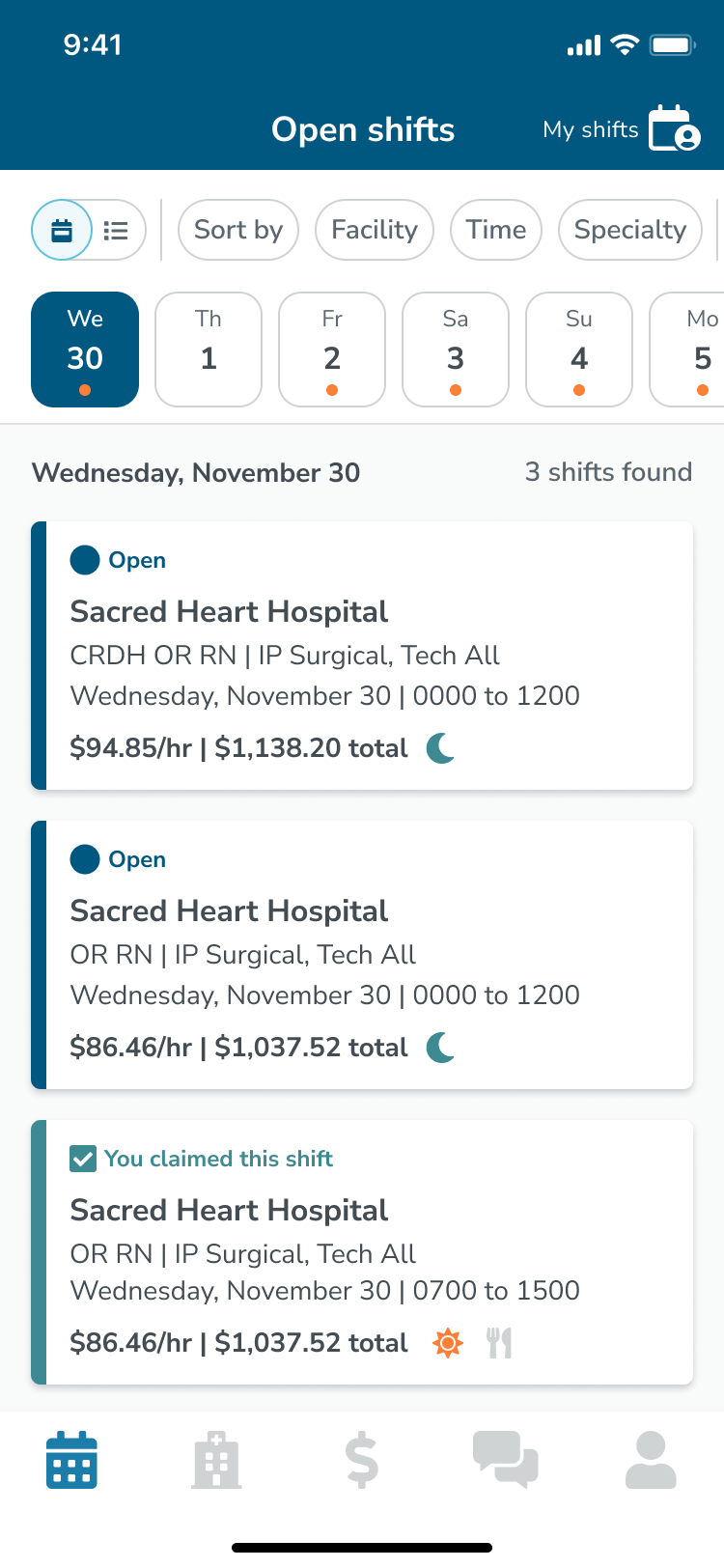
We had 3 weeks to explore and research CareRev nurses’ experience with obstacles to working shifts, as well as their preferences, needs, and expectations regarding claiming shifts. We collected 57 survey responses using Maze and conducted 6 30-minute interviews over Google Meet. We then organized our findings in an affinity map to identify trends.
We used prompts like:
Using Teresa Torres' Opportunity Solution Tree, I pinpointed the most significant opportunities based on our findings. The product manager and I individually brainstormed solutions and potential experiments, which we then presented and refined together. We populated the remaining branches with solutions and experiments that appeared to offer the highest user and business value. Among them, we were particularly thrilled about the potential of a new home screen and how it could serve as a platform to test out some of our brainstormed experiments.
Highlighted are the experiments related to a home screen that we decided to pursue
.jpg)
After selecting the experiments we wanted to pursue at this time we discussed ideas to measure their performance. Here are out two main key performance indicators.
I then generated sketches to explore how we could effectively deploy our brainstormed experiments within a home screen and explore how the tab bar and navigation might change with it's introduction. After reviewing and refining these ideas with the product manager, it was time to develop them into wireframes and get developer feedback.
At this stage, it was essential to loop in the developers to assess feasibility and level of effort. I created wireframes in Figma to provide a general outline of proposed solution and scope.
.png)
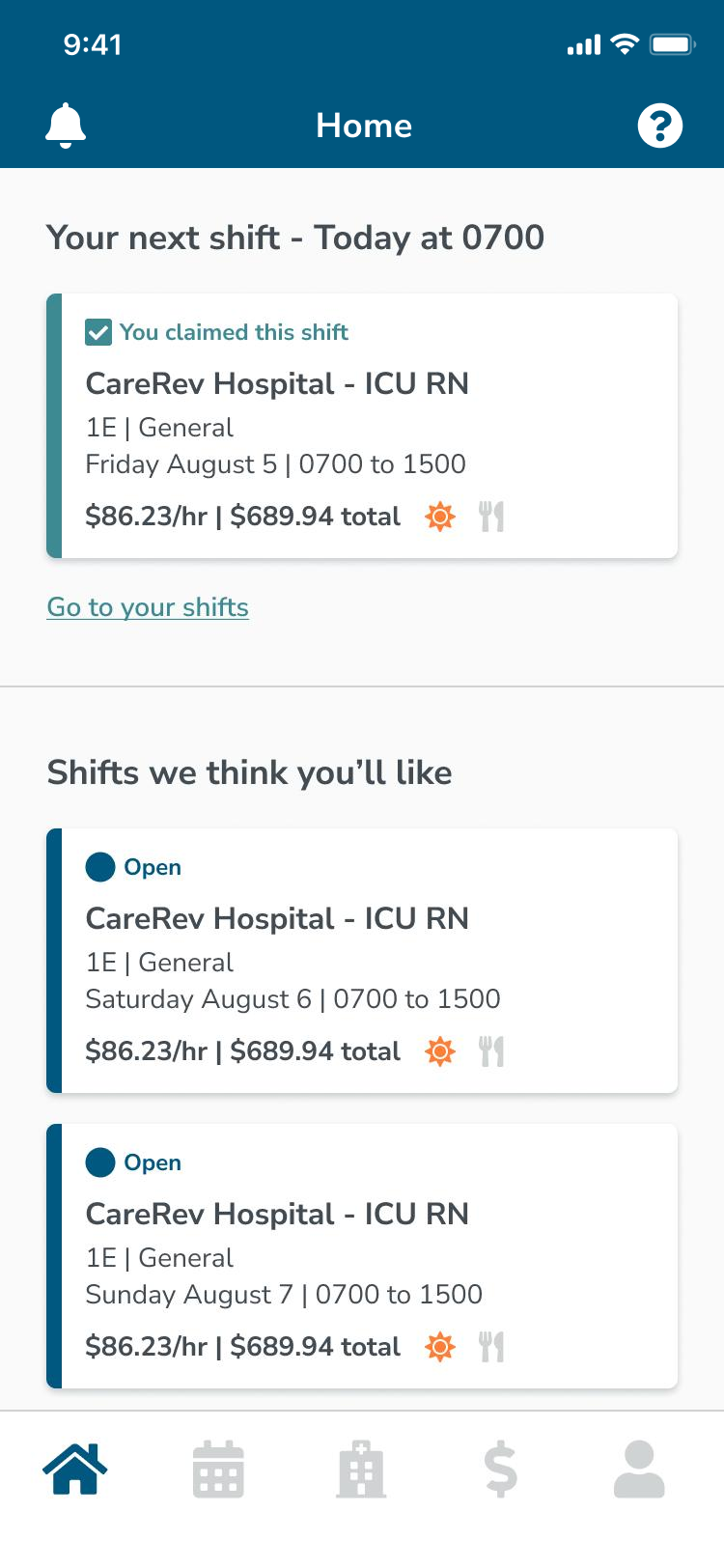
With no immediate concerns from developers about our proposed solution, I developed prototypes to put these three experiences in front of users:
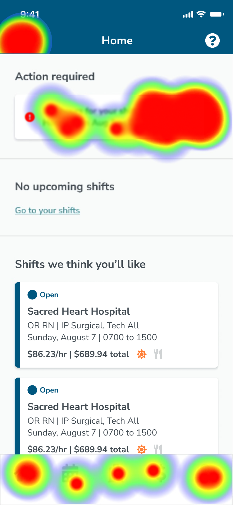
With an average success rate of 95%, it is evident that this solution is both viable and user-friendly. However, during testing, there were 6 misclicks on the tab bar, which I believe were due to testers trying to explore the new navigation. Notably, there were 25 clicks on the action card and 5 clicks on the notification bell in the toolbar. Although both were success paths, the notification bell was less obvious and requiring an extra tap. I hypothesize that the action card's lack of hierarchy and visual impact may have contributed to users tapping the bell icon. This can be supported by one user's suggestion that the expiring credential should stand out more.
👤 40 total testers
❌ 13.0% misclick rate
⏱ 10.12s average duration
✅ 95% average success
👋 3% average bounce (“gave up”)
“That I just went to the top left bell that had an alert and just addressed it without really having to look for it”
“The notice to complete was right at the top! Great placement. Very clear and noticeable”
“Maybe make it look more different or a bolder color to have it stand out more”
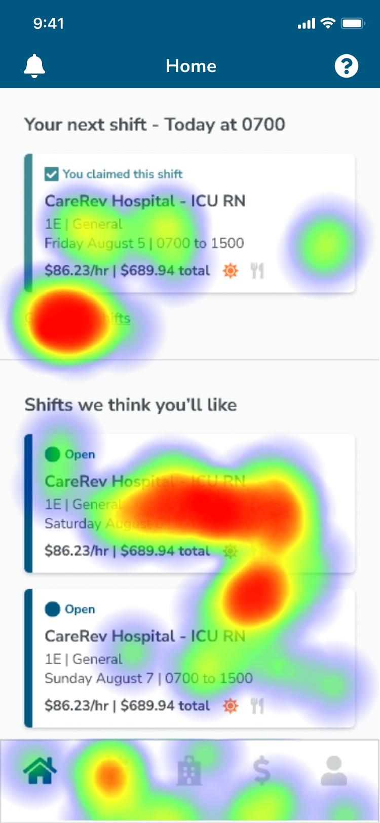
Testers encountered a slightly more challenging time with this task, but the majority of them succeeded. There were several instances of misclicks: out of 38 testers, 6 clicked on the claimed shift card, 4 clicked on another shift card, and 3 clicked on "Go to your shifts". The feedback from the open-ended question did not provide insights into why testers experienced these misclicks. Interestingly, all testers commented on how easy the task was overall, leading me to hypothesize that some of the misclicks might have occurred while they were exploring the prototype.
👤 38 total testers
❌ 38% misclick rate
⏱ 20s average duration
✅ 85% average success
👋 8% average bounce (“gave up”)
“I feel like this is easy because I’ve been using the app for a few years and it’s still user friendly, and similar to how I’ve been doing things all along”
“I personally like have the list of shifts rather than by date. It’s easier to scroll through!”
With confidence in the usability of the solution, I spent the next 3 weeks developing high-fidelity mock-ups. The elements of the final design are broken down below.
To enhance the hierarchy and visual impact of the action card, I made adjustments by reformatting and restyling the text. The most critical high-level information is now presented in bold and red to draw immediate attention.
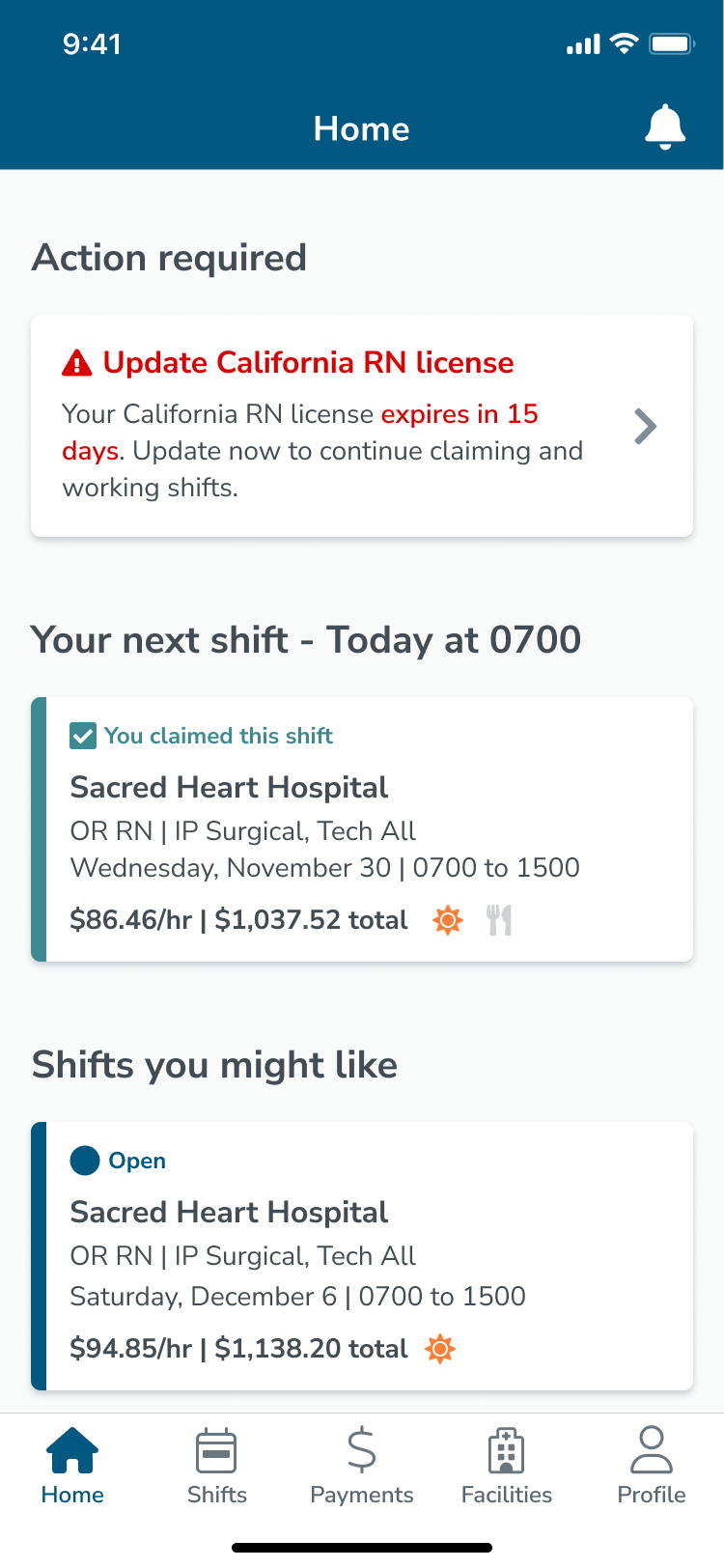
With no solid findings from the usability test, we chose not to make any significant changes in the final design.
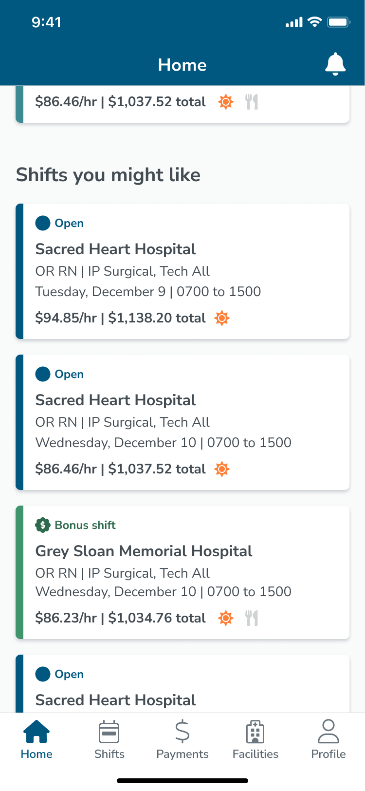
Because we were already doing work to the tab bar by adding in a home tab and removing the inbox tab, I thought to incorporate these changes as well to improve accessibility:

We launched the home screen in September of 2022 and started immediately receiving positive feedback. Three months after launch, we gathered the results below.
We launched the home screen in September of 2022 and 3 months later in December, found that CareRev nurses claimed an average of 5% more shifts between September 2022 and December 2022 than they did between June 2022 and September 2022.
Between the home screen's launch in September 2022 and December 2022, we observed an 11% decrease in the number of contacts to the CareRev support team regarding credential upload. This significant decrease indicates that the credential action cards effectively inform CareRev nurses about their expiring and expired credentials while offering a convenient point of entry to the credential upload workflow. Additionally, this saved 2000+ annual hours of internal employee time.