Creating a branding package and marketing site for a family counseling business
Live Sturdy | 2020 | 2 months
Branding
Graphic design

Branding
Graphic design
A brief story detailing the creation of a compelling brand identity, print and digital assets, and an informative marketing site for a family counseling business. The business owner and client, Keith, offers personal and relational development services and reached out to me to establish a brand to encompass his work.
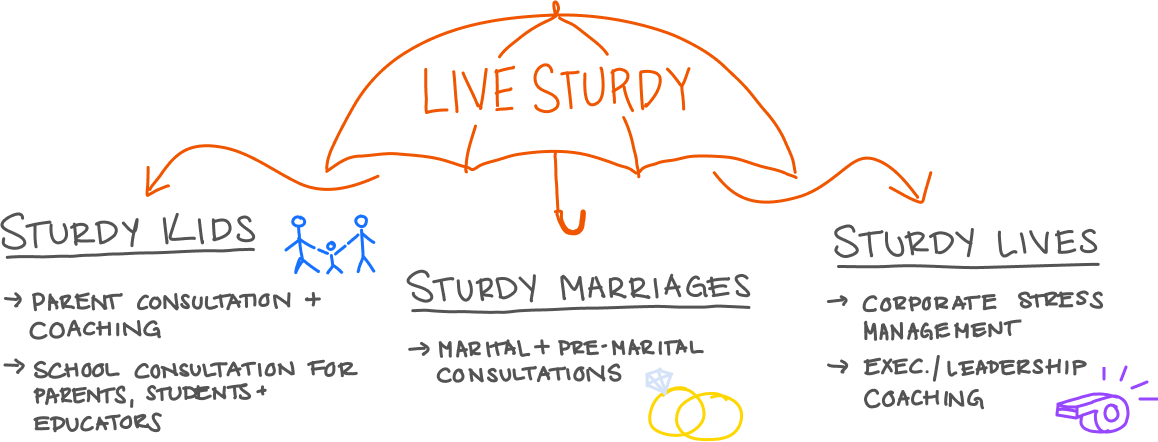
Live Sturdy's services fall in under three categories: Sturdy Kids, Sturdy Marriages, and Sturdy Lives. My client expressed that his main objective was to unite these services under a brand that that speaks to each category and client group.
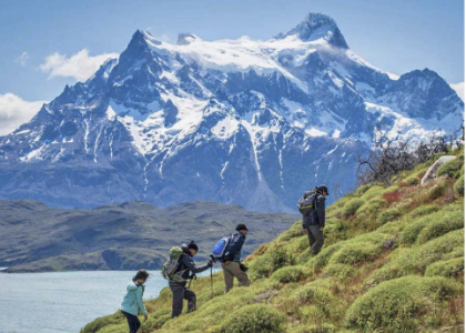
In getting to know my client more, I noticed a common thread throughout his work–his approach. Keith injects humor, anecdotal stories and colorful metaphors into his practice. As an avid outdoorsman, he often relates personal and relational struggles to physical challenges. His parting message is to always accept and embrace struggle in order to grow.
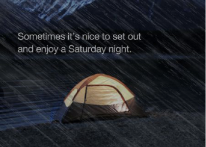
When conceptualizing, the feat of hiking a mountain immediately came to mind. "Living Sturdy" requires one to adapt a similar mindset as one would take on a physical challenge with, like climbing a mountain–the struggle is real but the reward is sweet. My client was immediately sold on this idea and excited that it not only spoke to him personally, but it captured the spirit of his consultancy.
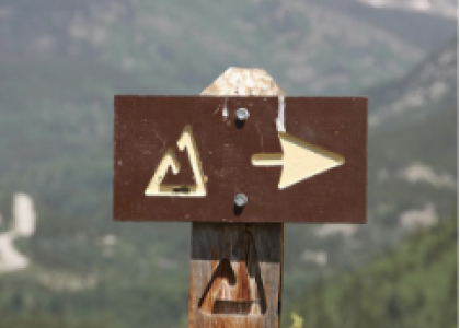
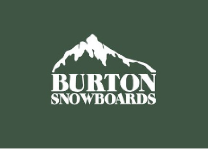
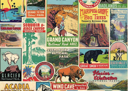
For some inspiration, I took a look at the branding of successful outdoor and recreational companies. Campaigns from The North Face, postcards and patches from the National Park Service, and the Burton Snowboards logo use symbolic imagery, heavy typeface, vivid hues, and badass phrases in order to convey the performance, resilience, and spirited nature of not only their products, but of their clientele.
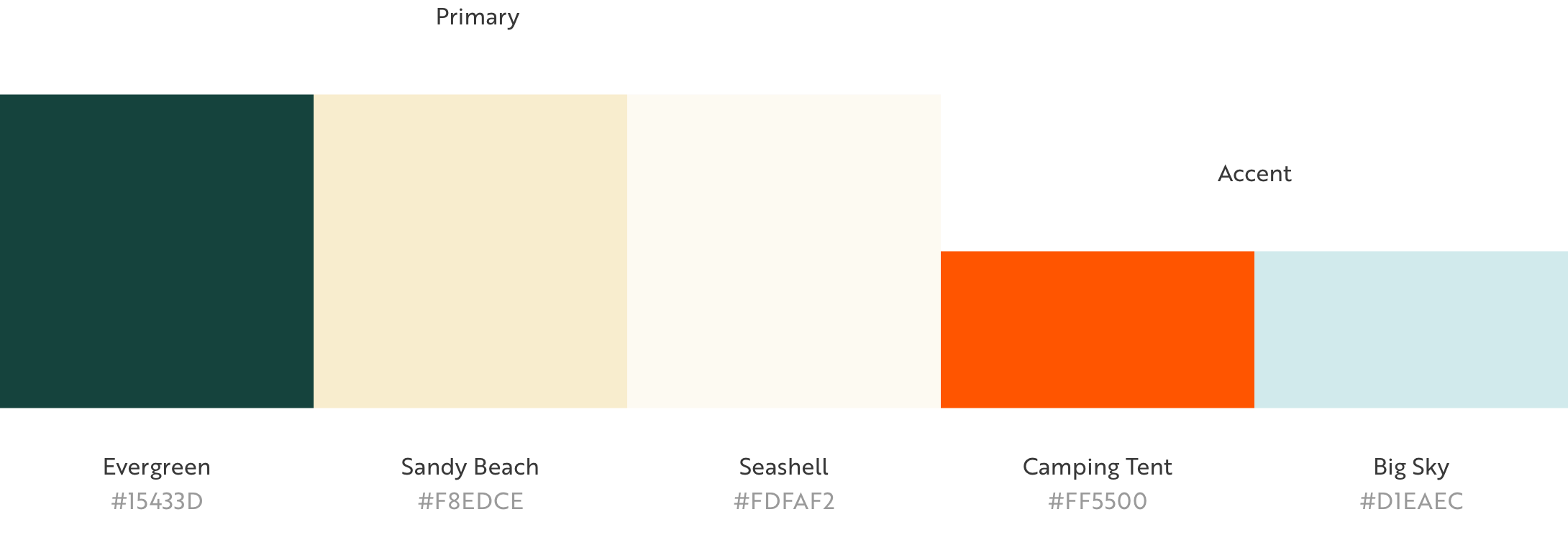
In selecting the Live Sturdy colors, I pulled hues found in mountainous landscapes and in materials used for recreation equipment to create for an inviting, fun, and grounding color palette.
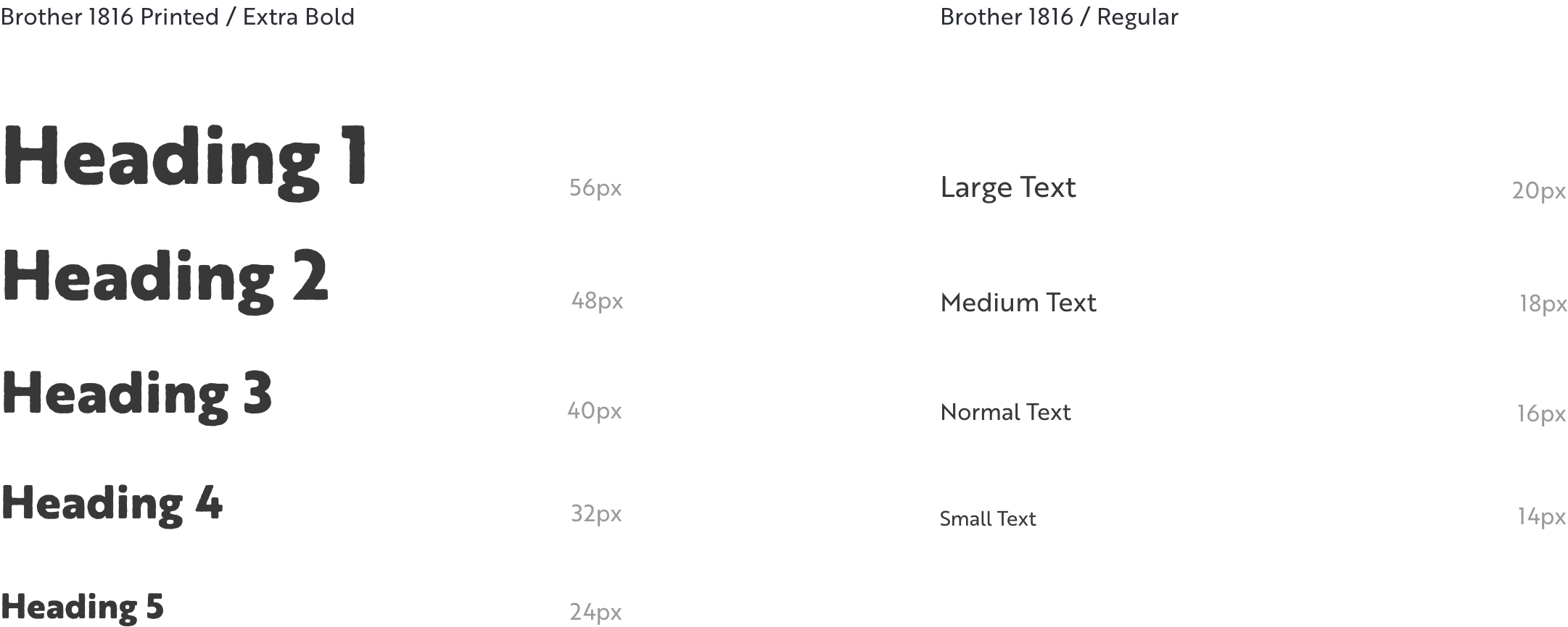
I selected Brother 1816 for body text as it has an approachable feel made for easy reading. For headings, I selected Brother 1816 Print as it has textured edges looking almost like uneven trail. Together, both body and heading styles deliver Live Sturdy with a punch while remaining friendly and easy to read.
Once the concept and style guide was finalized, we jumped into logo designs. My client envisioned three parts of the logo for the three sects of Live Sturdy. He expressed that he'd like each part to be able to stand alone as well.
In this first pass, a family is centered in the foreground while a mountain scape and a home fills the background. This imagery works to convey the nature of Live Sturdy—being centered around people and relationships as a consulting company, while conveying their distinct approach of placing value on struggle.
My client responded well to the first set of logos and expressed that he'd like to see a higher level of detail in the human forms, and another version without the human forms at all as he raised concerns that it may look to busy.
I started off by developing the elementary human forms into a detailed family of hikers to enforce the concept of hiking a mountain.
For this second option, I replaced the hikers with a family of bears. I aimed to meet my clients wishes in simplifying the level of detail while still conveying a family unit.
Reassessing the use of the logo, my client determined that a single logo would suffice and that changing the text might be more effective. We had concerns with the previous logos looking too busy with the representations of the family unit and decide to omit it and lean into the outdoor branding theme.
In this option, I have placed the primary focus on the mountain scape with the sun breaking from the clouds, where the clouds represent the hard times and the sun represents the good.
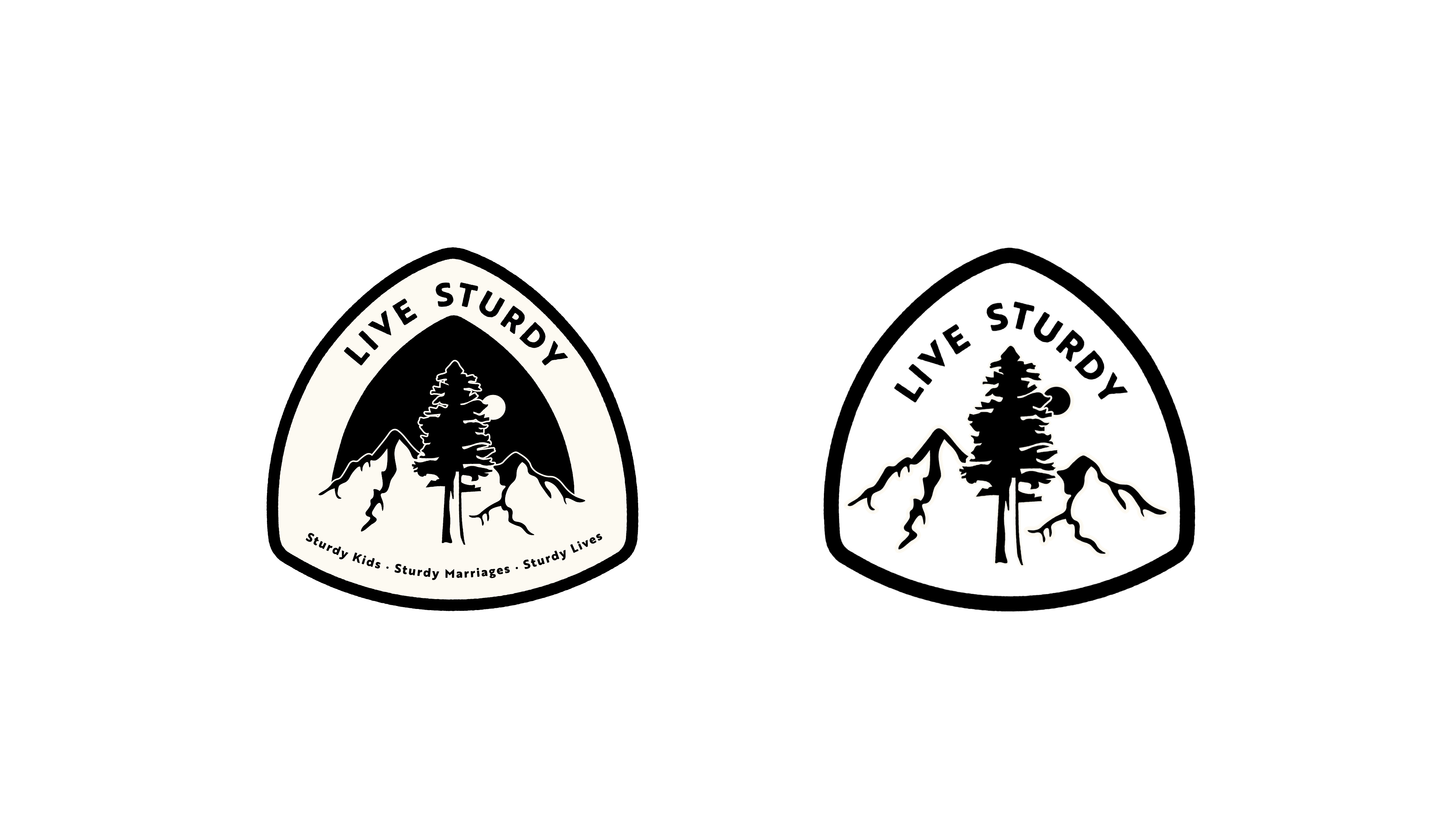
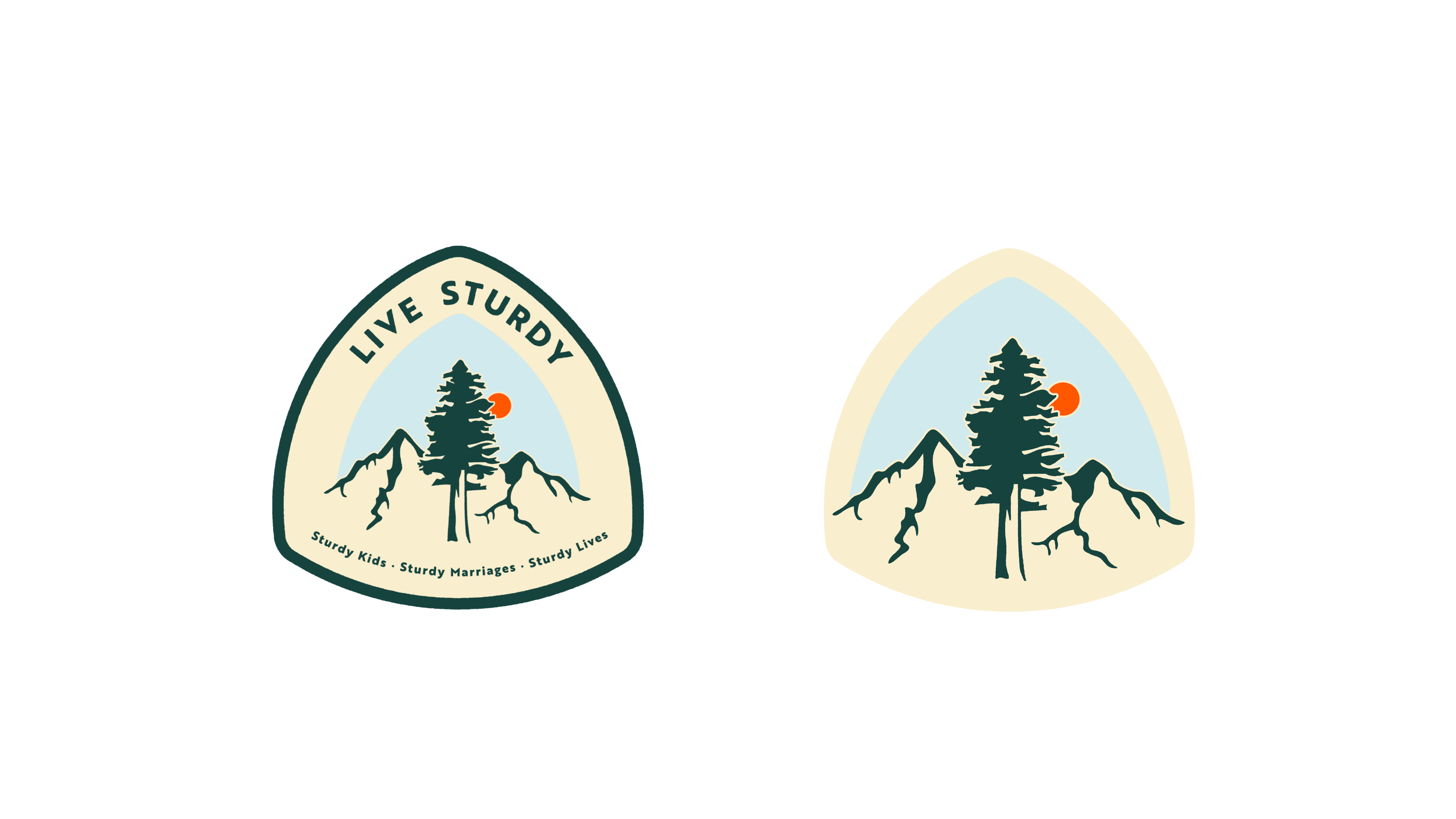
My client suggested that a redwood tree would serve to convey sturdiness. In this option I placed a redwood front and center with a mountain scape filling the background. We felt that this option was most representative of the Live Sturdy brand and declared it as the winner!
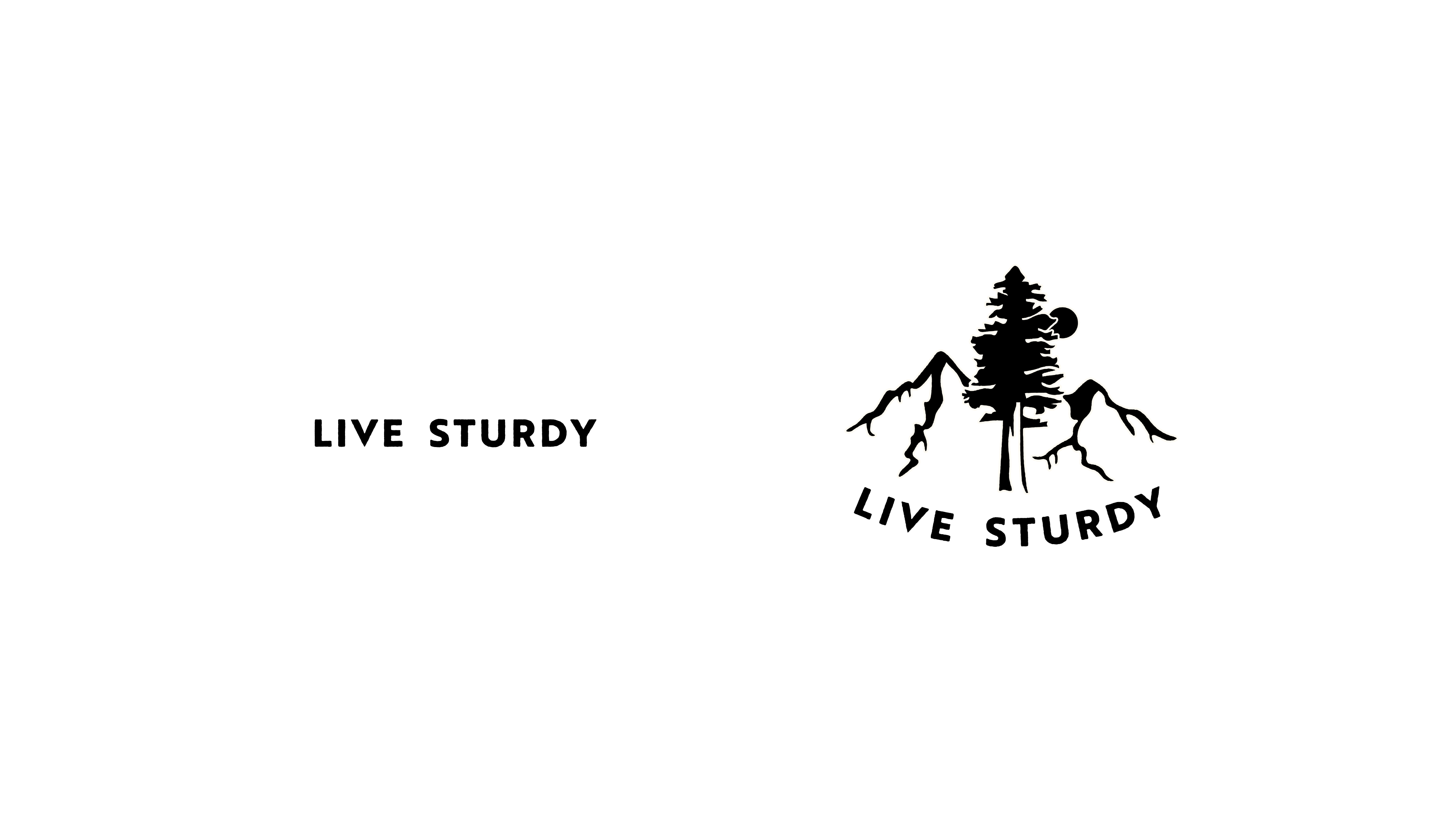
I spent the following week refining the winning logo and developing monochrome and color versions.
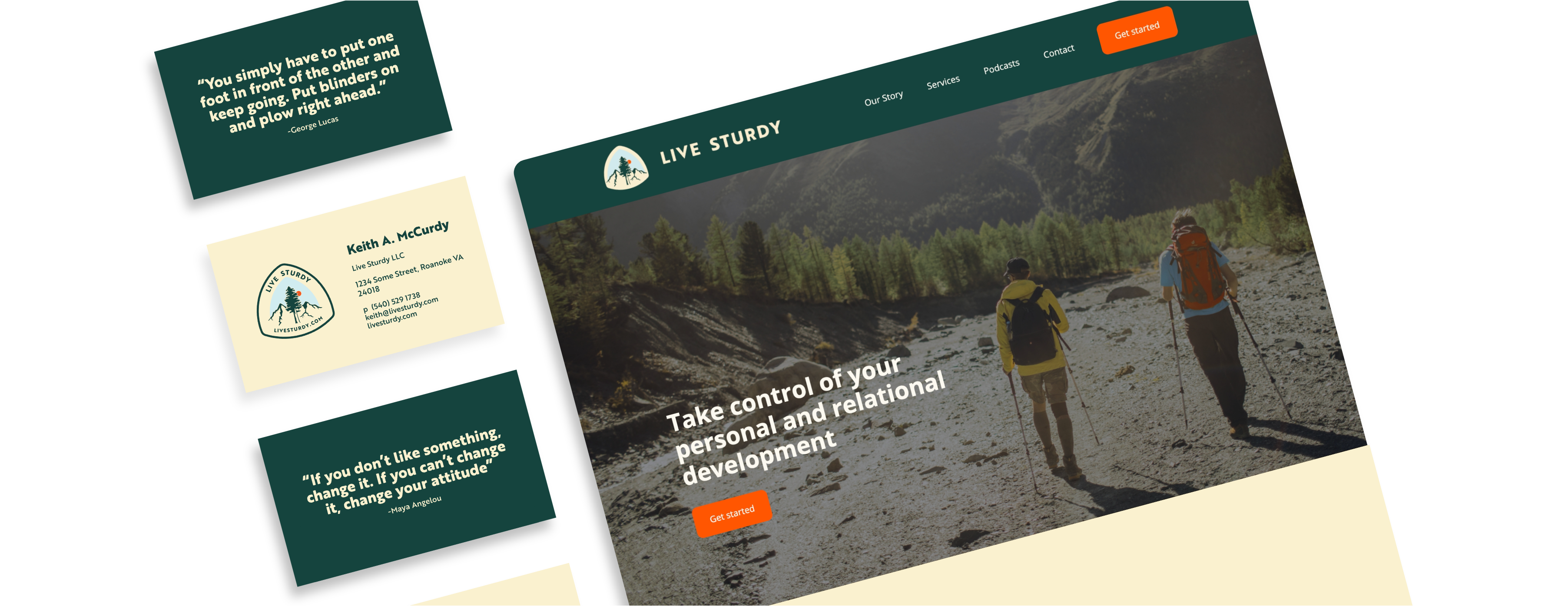
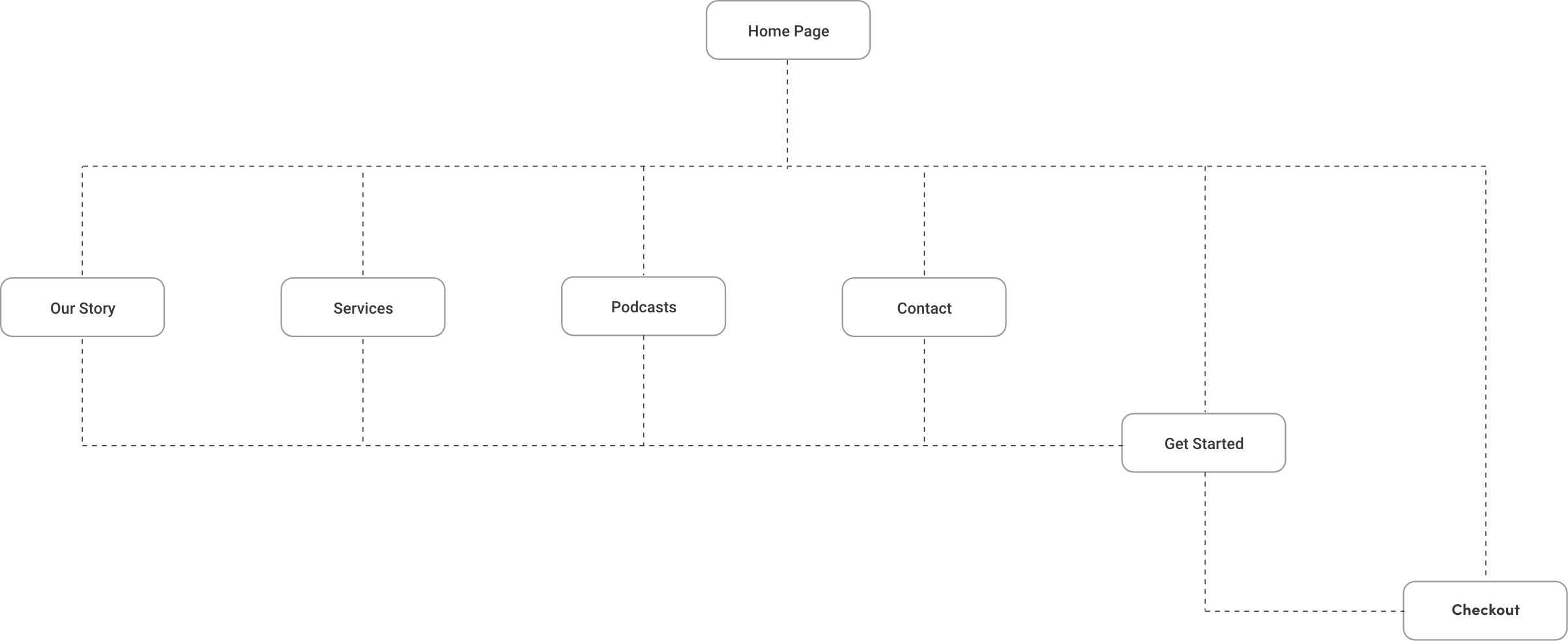
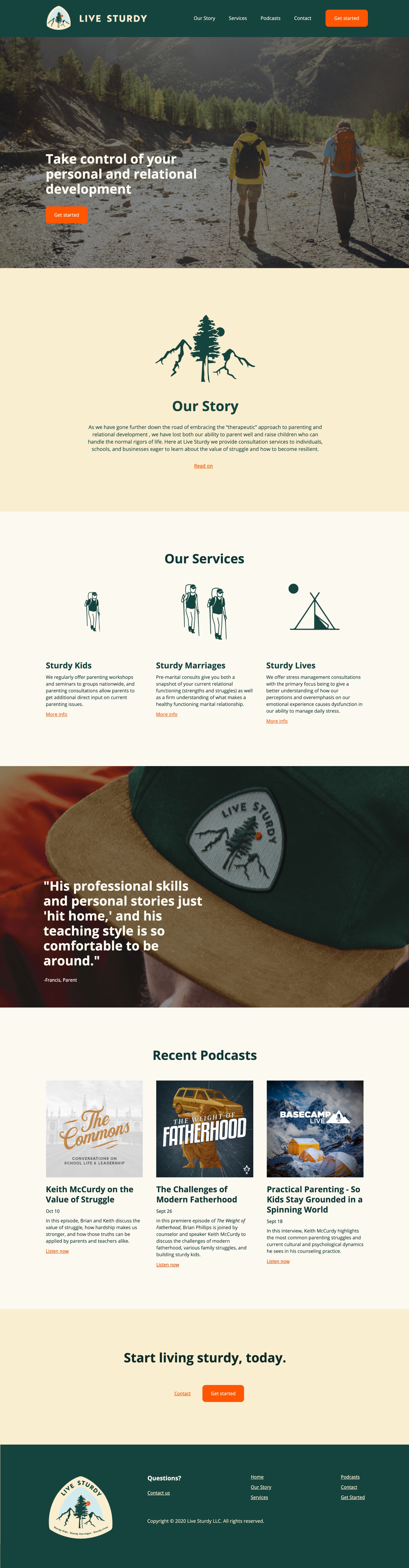
My client asked for a simple website to house information on his services, links to podcasts he's been featured on, his contact info, and a checkout portal for his clients wishing to pay for his services.
I first assembled a site map showing the relationship between each page and the primary objective, to get started with and pay for my clients services.
My client provided me with information he thought appropriate for each page. From there I began synthesizing and organizing the information along with fleshing out a landing page to extract important bits of information nested on each page.
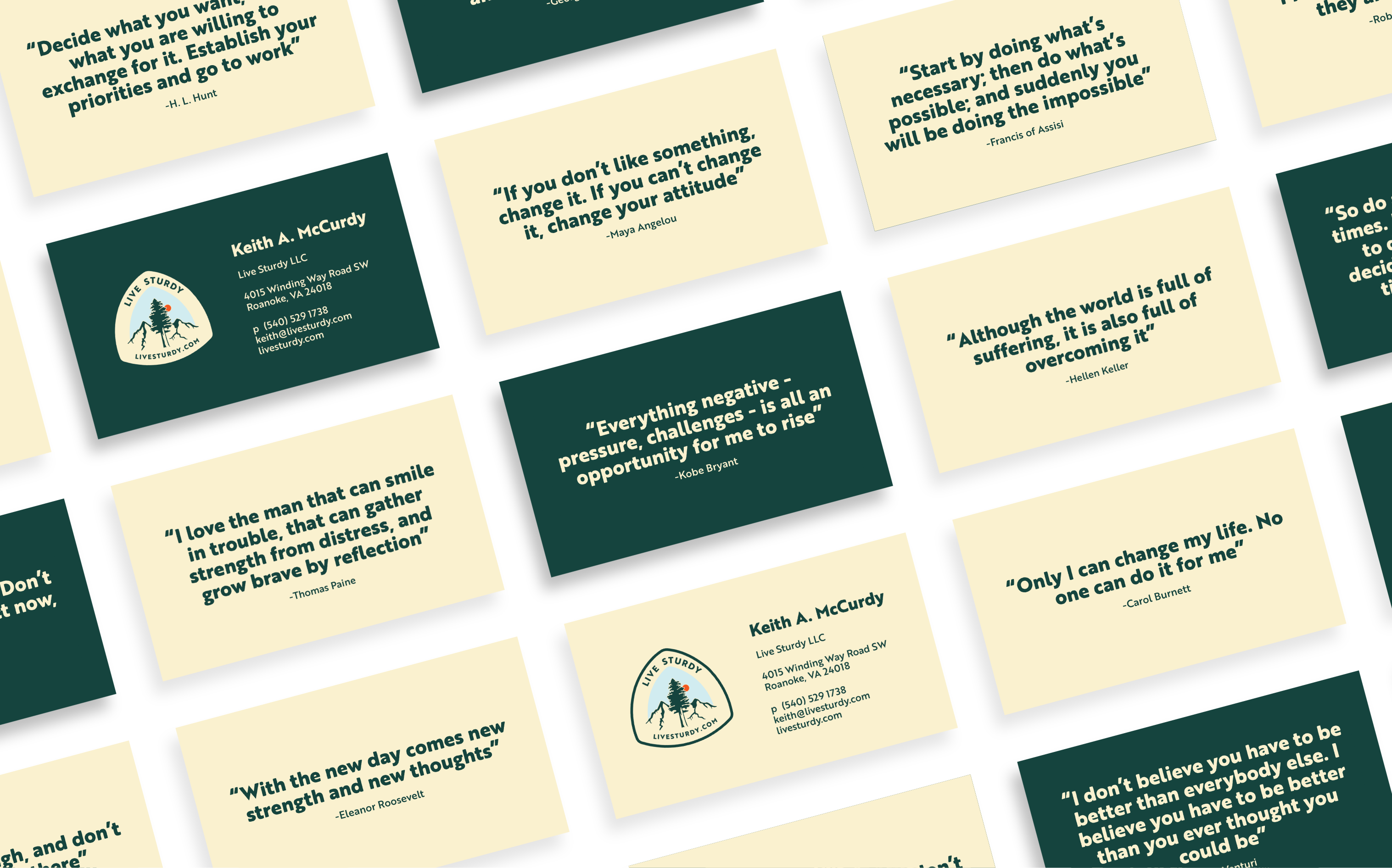
My client requested designs for business cards showing basic information and a the fresh, new logo. I proposed the idea of placing various motivational quotes on the blank sides to add more value for the recipient. My client loved the idea and suggested we use quotes that particularly tie in to his teachings.
My client was and continues to be extremely happy with the brand and marketing site. He previously spent hours each week emailing back and forth with his own clients about information that is now accessible on the site.
My client and I have worked together since to make modifications to the site. Please visit livesturdy.com to experience it in its current state.