Optimizing a loan evaluation and processing workflow
Product Design
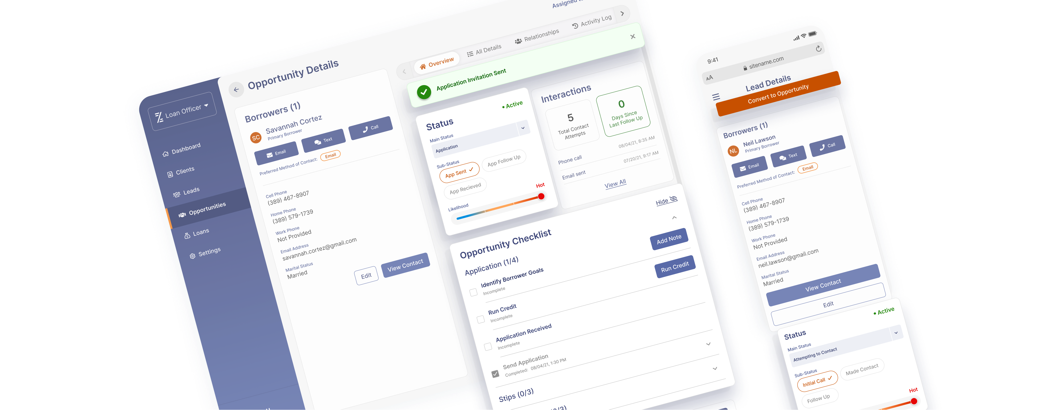
Product Design
The following outlines a 5 week-long design project to speed up and simplify a home loan evaluation and processing workflow. This workflow was a key piece to the launch of Cosmos, a new Saas CRM product to replace a clunky and outdated legacy app.
UX/UI Designers - Me, Elise Munoz
Product Manager - Jessica Chen
Business Analyst - JaQuisha Harris
UX Researcher - Joshua Han
The Product Manager, Business Analyst, and UX Researcher had one-on-one conversations with lenders about their experience with. Based on the feedback, they assembled a general diagram to demonstrate the workflow, and presented two major findings:
Lenders need to see the latest activity and what status the loan is in so they can quickly
take action and process more loans. Many lenders reported tracking activity on paper and in word documents.
Lenders felt that the app was overly complex and made a fairly simple process daunting and time consuming. Some seasoned lenders felt that it took them upwards of a year to be fully adept at using the app.

Led by user research and guided by LEAN UX framework, the team came together frequently to collaborate, quickly iterate, and repeatedly touch base with our users throughout 2, week-long design sprints. In the 3 weeks following, I worked with one other UX/UI designer to develop high-fidelity mock-ups ready for handoff.
Empathize
1 on 1 interviews
Define
HMW statements
Ideate
Lightning demos Brainstorming
Sketching
Prototype
Wireframing
Rapid prototyping
High-fidelity mock-ups
Test
Usability testing
We kicked off the design process with collecting and sharing inspiration. Reoccurring ideas include using pizza trackers and colorful graphics to indicate progress.
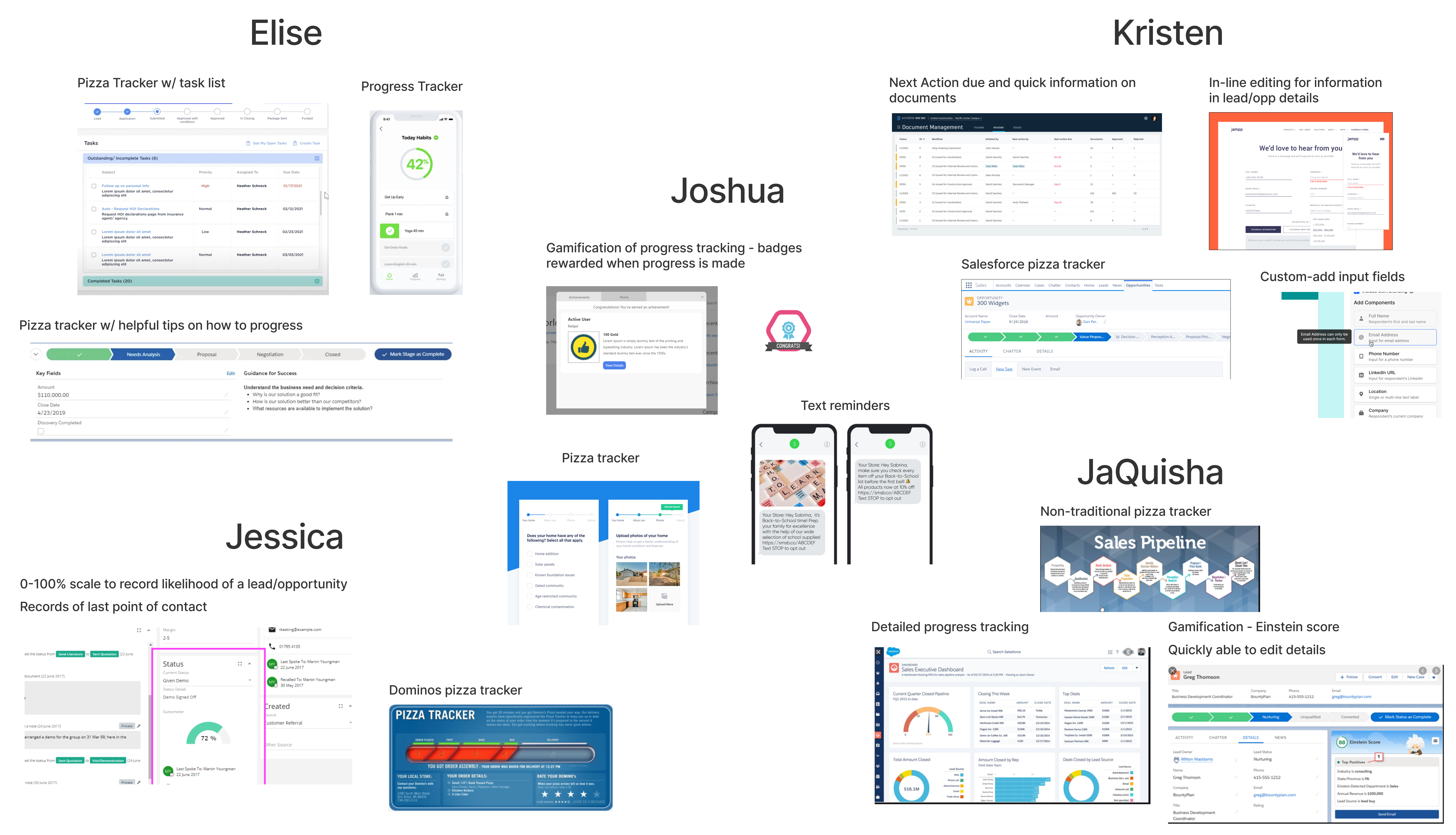
Working off of our inspiration we separately sketched solutions. We then voted for ideas and collectively selected two ideas to move forward with:
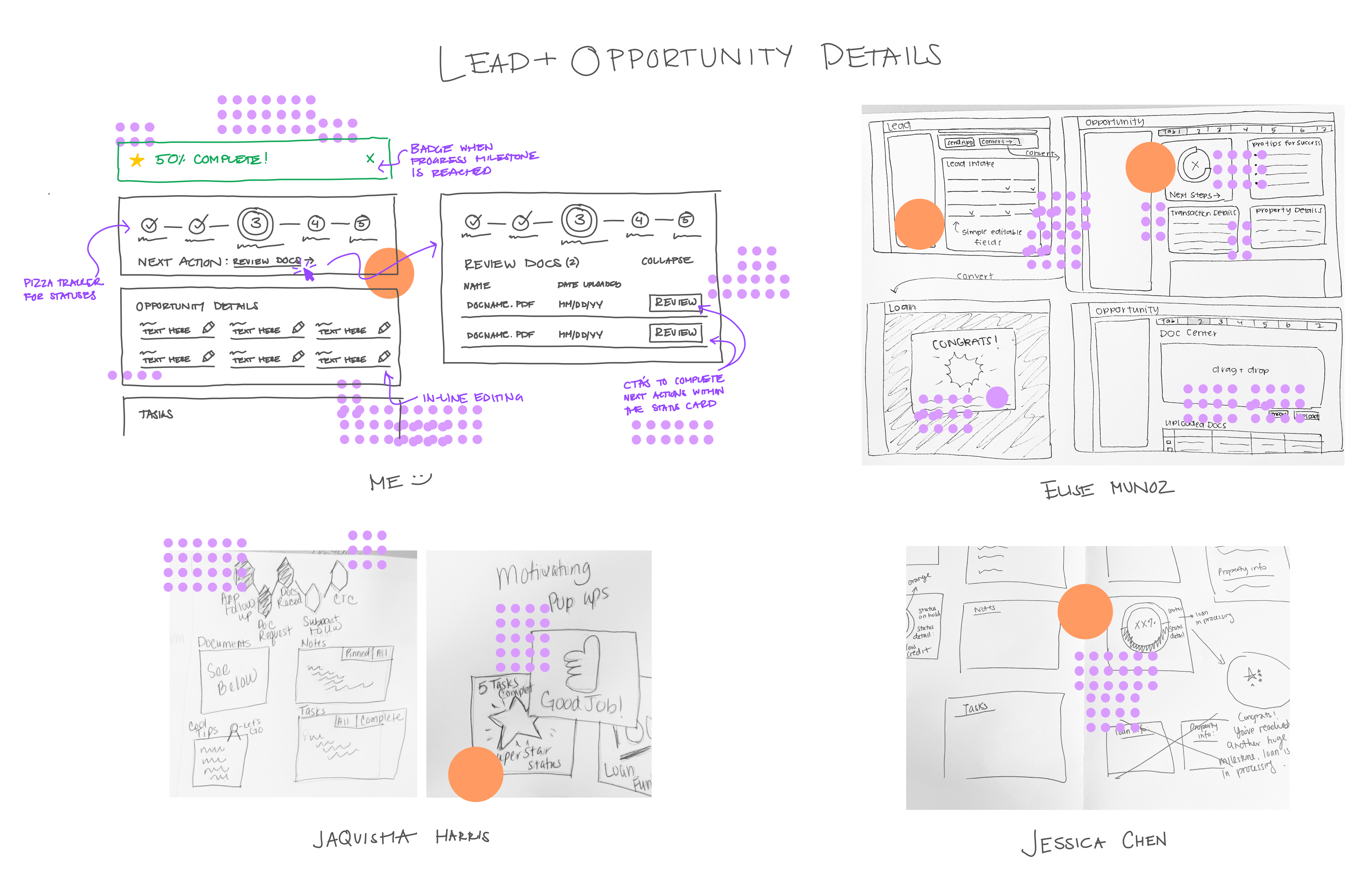
Working off of the top-voted sketches, we developed preliminary prototypes in preparation for usability tests in the following days. In between usability tests, we continued to develop the prototype in direct response to user feedback.
Referring to the customer journey map, lightning demos, and sketches, we created separate cards for opportunities and leads denoting their progress. The pizza tracker design captures and conveys completed steps, current step, and next steps. Buttons with clear call to action messages direct and allow the user to complete the next step straight from the card.
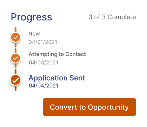
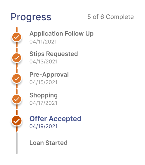
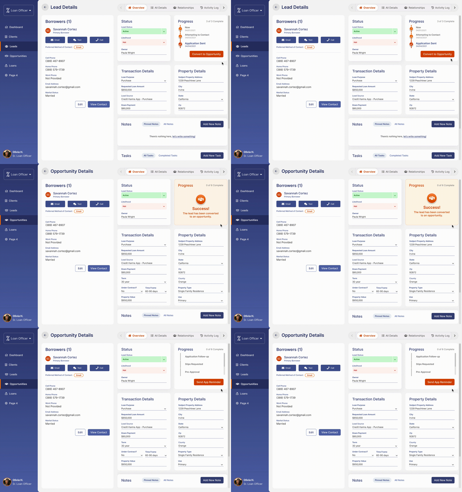
We planned for 4, 15-minute long moderated usability tests with lenders, but by the second interview, we found that our design failed to meet both of our testers' needs. Given that, we cancelled the remaining two test sessions.
Both testers reported that the progress tracker did not accurately represent progress and statuses in these key ways:
JaQuisha Harris (Business Analyst), Jessica Chen (Product Manager), and Joshua Han (UX Designer), revisited their conversations with lenders regarding lead and opportunity statuses.
The research team revisited their conversations with lenders regarding their workflow and adjusted the diagram to demonstrate these two things:

With confidence in our understanding of the workflow's requirements, we planned for another week-long design sprint. With a firm timeline, myself and the other UX/UI designer assured the team that we would be able to deliver fidelity mock-ups in three weeks as opposed to our allotted four.
We kicked off the second sprint with creating and sharing lightning demos. New ideas include nesting statuses in drop-downs, and checklists of complete, incomplete, and suggested action items.
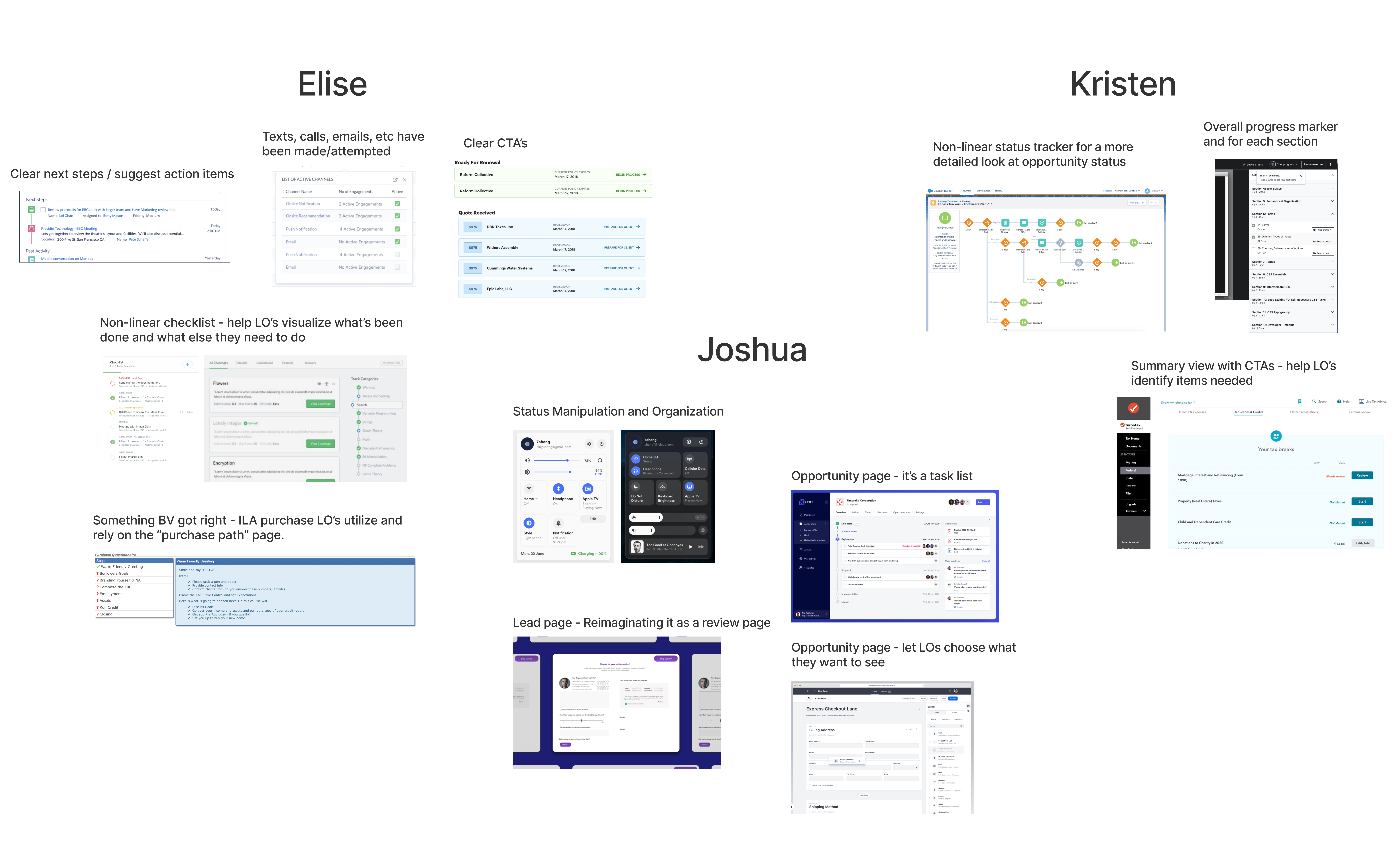
Working off of our inspiration we separately sketched solutions. We then voted for ideas and collectively selected three ideas to move forward with:
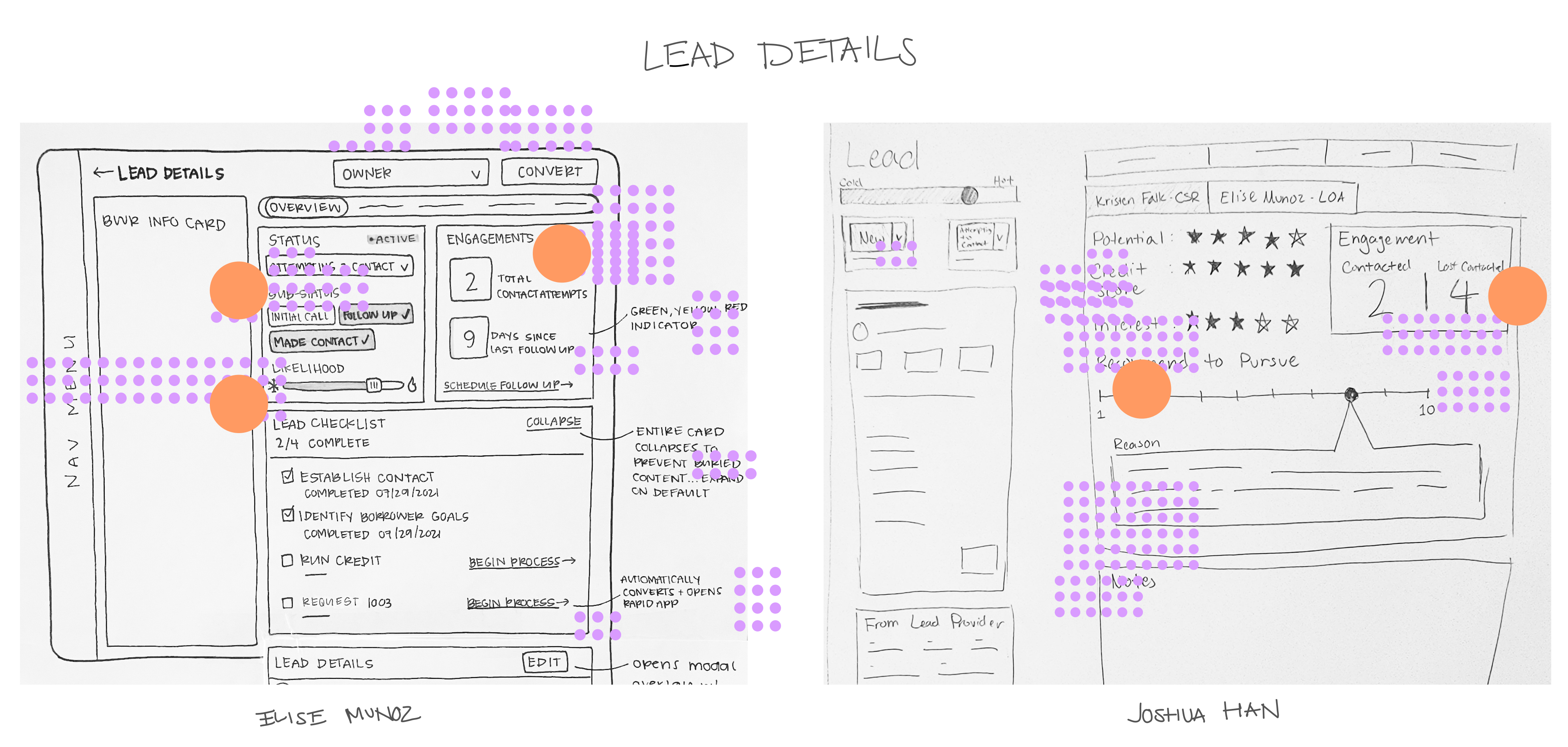
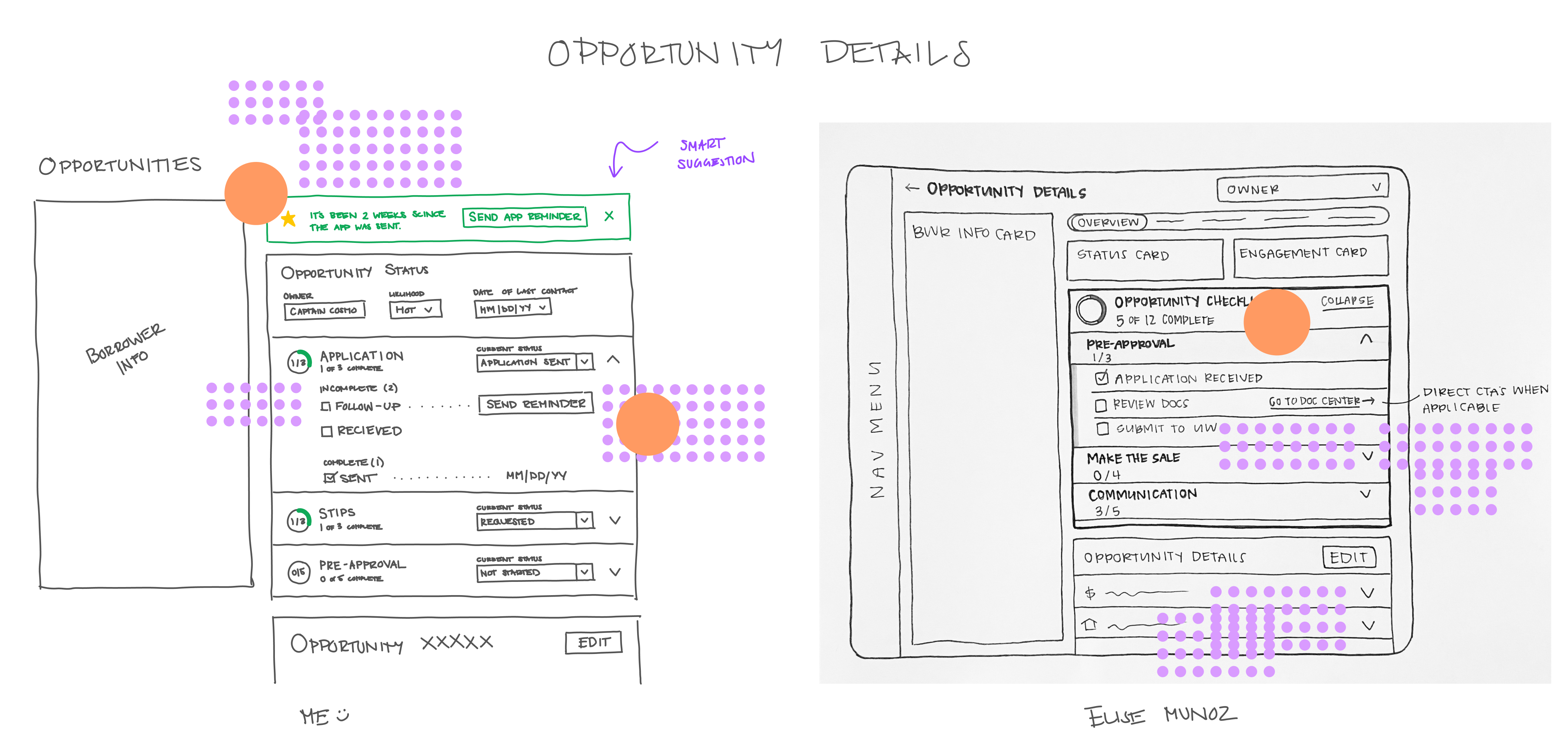
Working off of the top-voted sketches, we developed preliminary prototypes in preparation for usability tests in the following days. In between usability tests, we continued to develop the prototype in direct response to user feedback. We focused our effort on three key experiences:
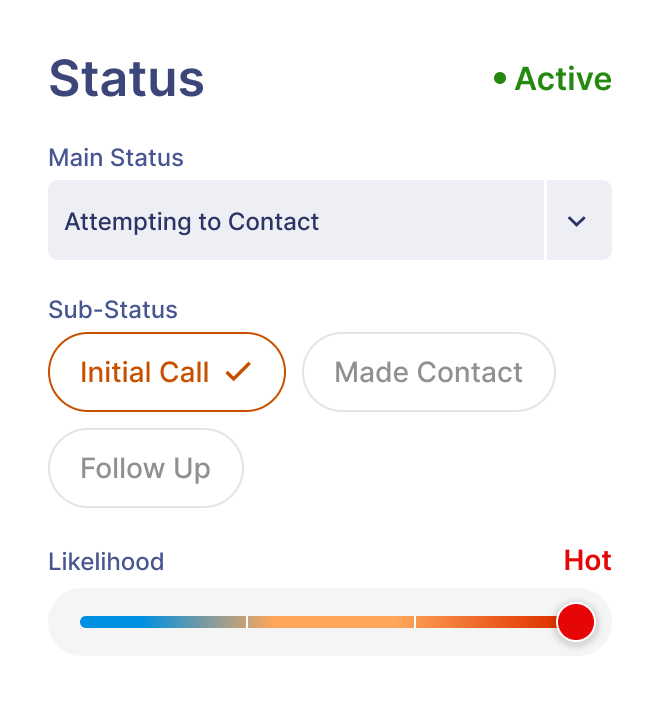
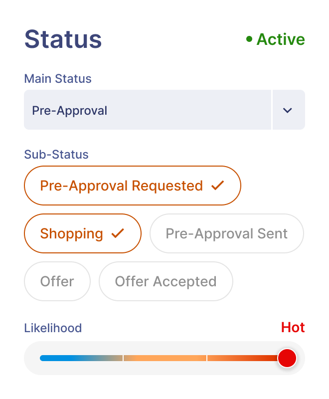
We redesigned the status card to accurately represent how lenders use loan statuses.
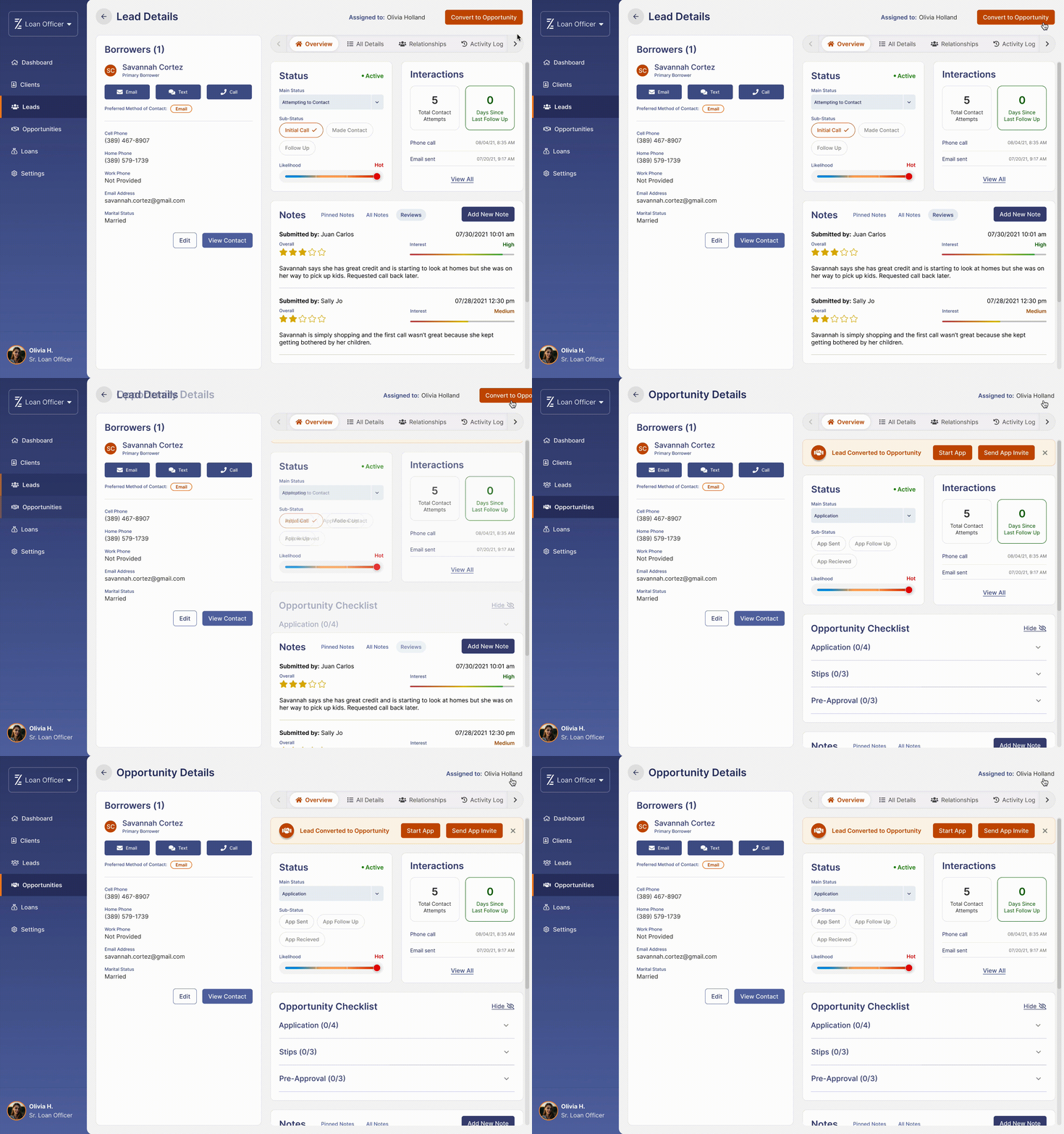
Converting a lead to an opportunity is required before starting the application process with prospective home buyers. As moving applications is a primary objective for lenders, we placed a convert button at the top right the page for optimal CTA placement. The bright orange hue commands the attention of users and remains static while scrolling as to never leave frame of view. Once an opportunity, a banner flies that prompts the user to start the application process.
.gif)
The opportunity checklist was a result of a user need found that most lenders quickly want to see next steps and take action. During usability testing, we found that more seasoned lenders found the checklist more so distracting than helpful. We implemented a hide option which collapses the checklist and moves to the very bottom of the content scroll.
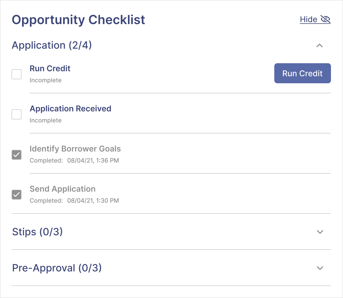

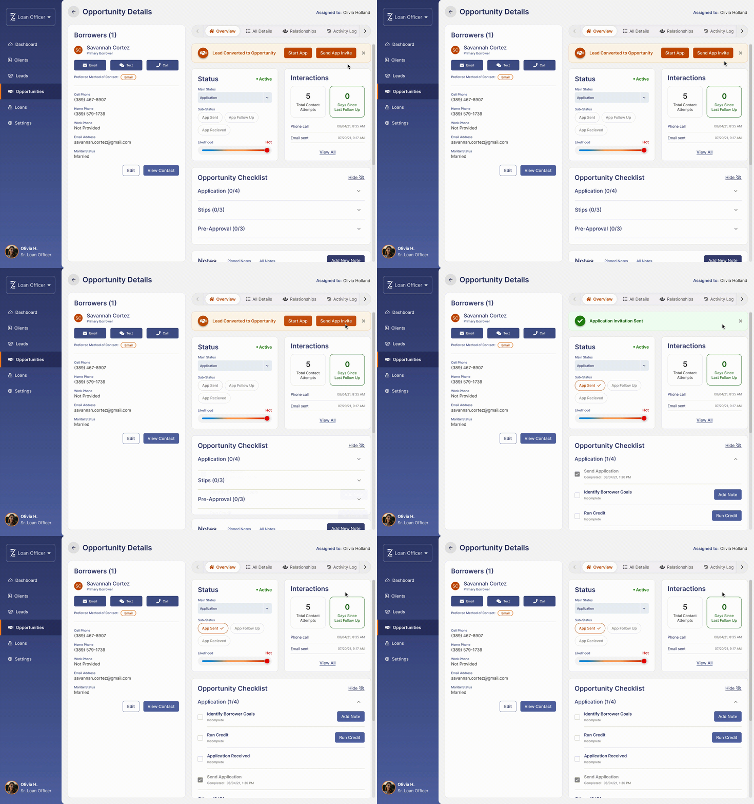
.gif)
We conducted five moderated usability tests with lenders and found that the testers navigated through the flows with ease and minor frustration. With all five testers succeeding in the completion of various tasks, it is likely that the solution as a whole is both viable and user-friendly.
Despite the initial setback and a shorter timeline for high-fidelity mock-ups, we met our goal of delivering final designs to stakeholders on time. It was a challenge, but myself and the other UX/UI designer were able to complete hi-fidelity mock-ups over the course of three weeks instead of four. The design received approval from all stakeholders and was then developed, but due to leadership changes, Cosmos was never launched and the focus changed to making improvements to the existing legacy app.
Despite the initial setback and a shorter timeline for high-fidelity mock-ups, we met our goal of delivering final designs to the development team on time. It was a challenge, but myself and the other UX/UI designer were able to complete hi-fidelity mock-ups over the course of three weeks instead of four.
The Cosmos MVP was fully built out and was ready for launch, but due to leadership changes, Cosmos was never released as the focus changed to making improvements to the existing legacy app.