Crafting a comprehensive notification system for a web-app
New American Funding | 2021 | 6 weeks
Product Design
UX Research

Product Design
UX Research
The following outlines a 6 week-long design project to craft a comprehensive notification for Bridge, a CRM for mortgage lenders.
UX/UI Designers - Me, Laura Ramos, Elise Munoz
Product Manager - Ryann Thomas
UX Researcher - Joshua Han
A survey was sent out regarding in-browser notifications and it garnered 76 responses. Here are some general findings we wanted to dig into more:
A survey was sent out regarding in-browser notifications and it garnered 76 responses. Here are some general findings we wanted to dig into more:
82% of lenders felt that they get too many, 17% felt that they received the right amount, and 1% felt that they received too little.
53% of lenders find them unhelpful, while the remaining 47% find that them helpful.
Led by user research and guided by LEAN UX framework, the team came together frequently to collaborate, quickly iterate, and repeatedly touch base with our users throughout a week-long design sprint. In the 3 weeks following, I worked with two other UX/UI designers to develop high-fidelity mock-ups ready for handoff.
Empathize
1 on 1 interviews
Affinity mapping
Define
HMW statements
Problem statements
Ideate
Brainstorming
Lightning demos
Sketching
Prototype
Wireframing
Rapid prototyping
High-fidelity mock-ups
Test
Usability testing
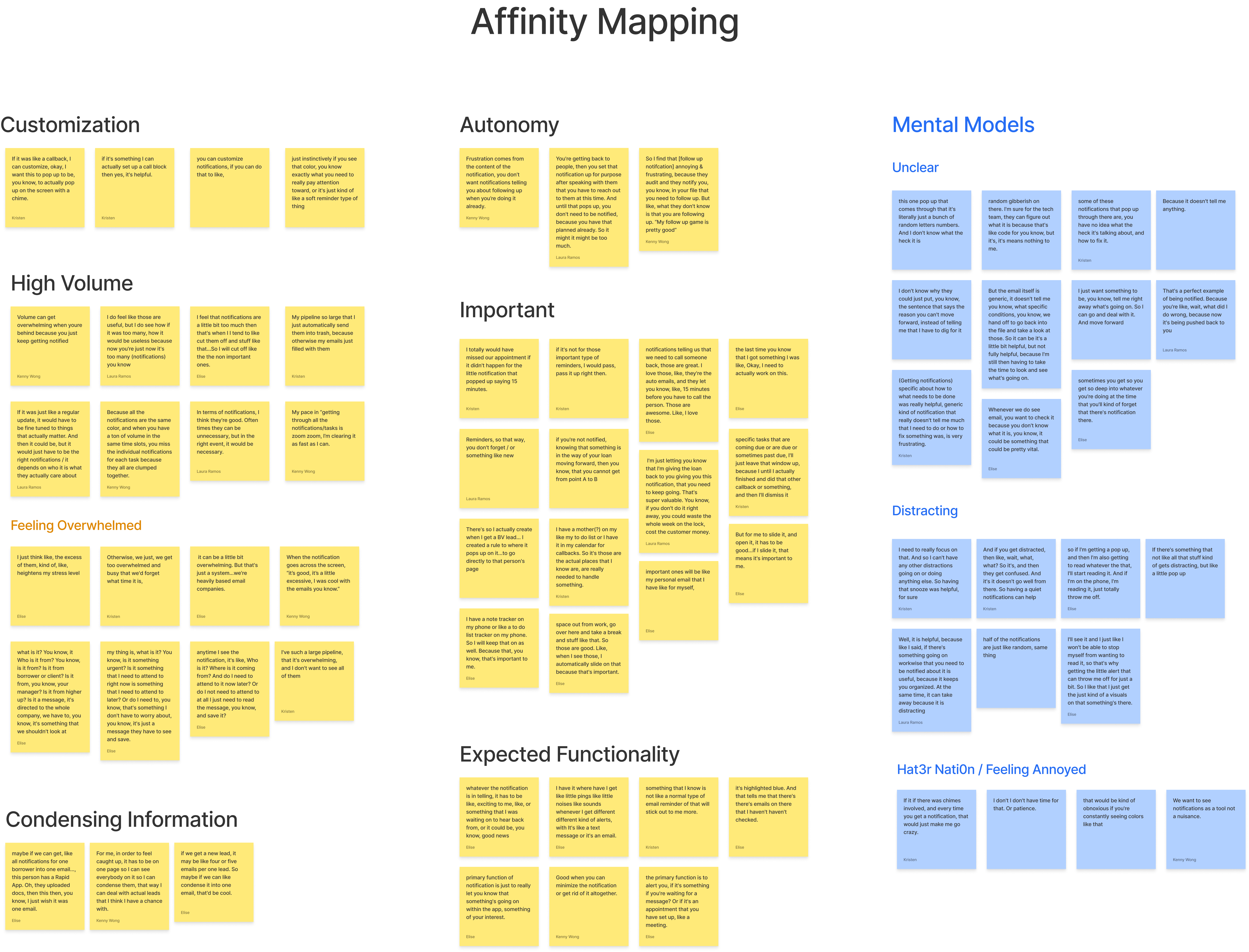
The user researcher conducted 6, 1-on-1 interviews with lenders to better understand their mental models, processes, workflows, impressions, and pain points surrounding notifications. As team, we parsed the transcripts and categorized quotes in buckets to identify these trends:
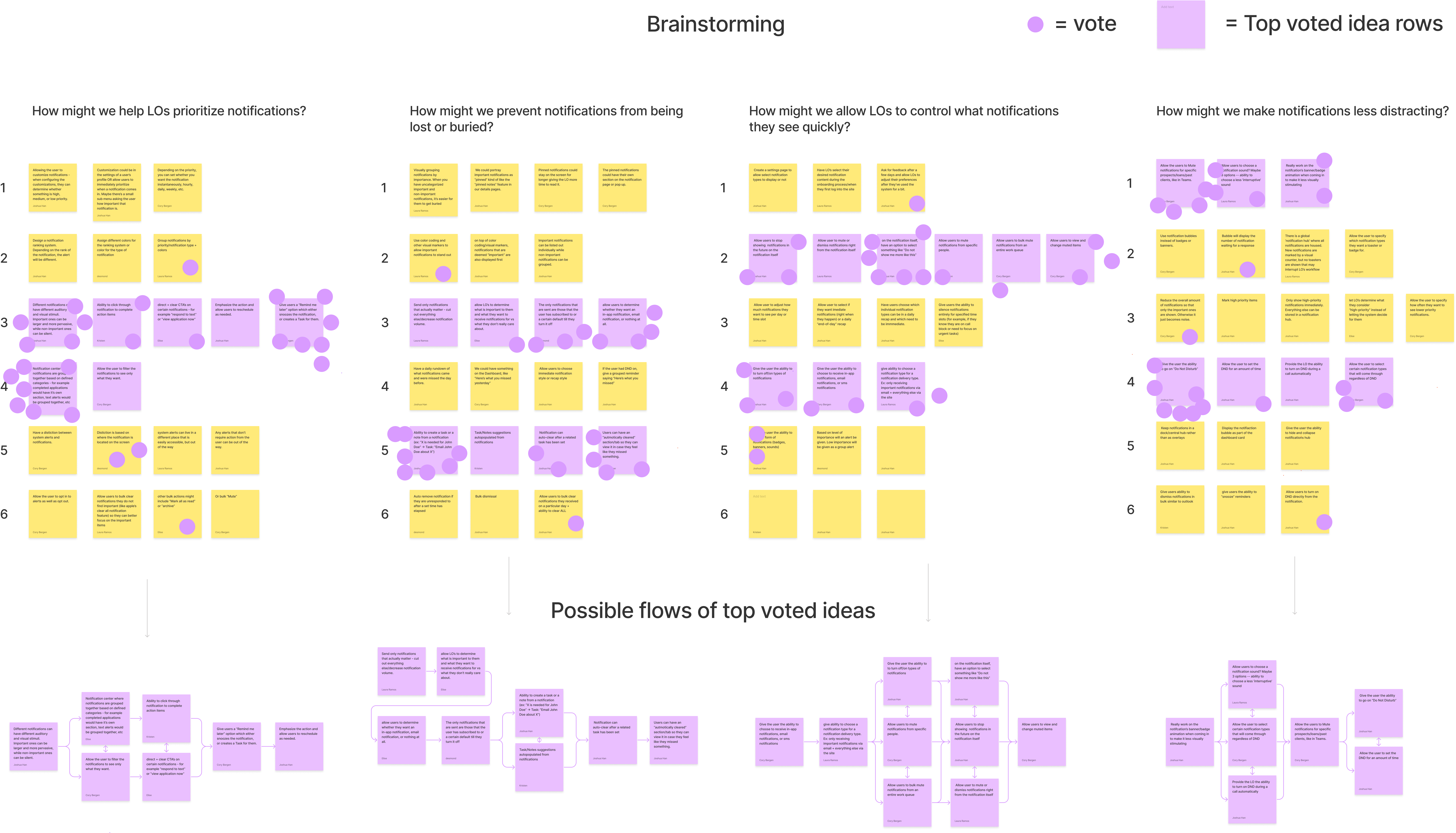
We started with a set of questions derived from the qualitative analysis and started writing down different solutions in each column and expanding upon them in each row. Once all ideas were on the table, we casted our votes on which row we saw most potential in. From there, we sorted the top voted ideas in a rough, chronological order.
How might we help loan officers prioritize notifications?
How might we prevent notifications from being lost or buried?
How might we allow loan officers to control what notifications they see quickly?
How might we make notifications less distracting?
In preparation for the design sprint the following week, the team and I came together to formulate a set of problem statements to base our designs around.
We kicked off a week-long design sprint with creating lightning demos, an exercise in which all team members collect and share inspiration from other companies that have formed solutions for similar problems. Reoccurring ideas include introducing different banner styles, a hub for all notifications, and the ability to go on "do not disturb" mode.
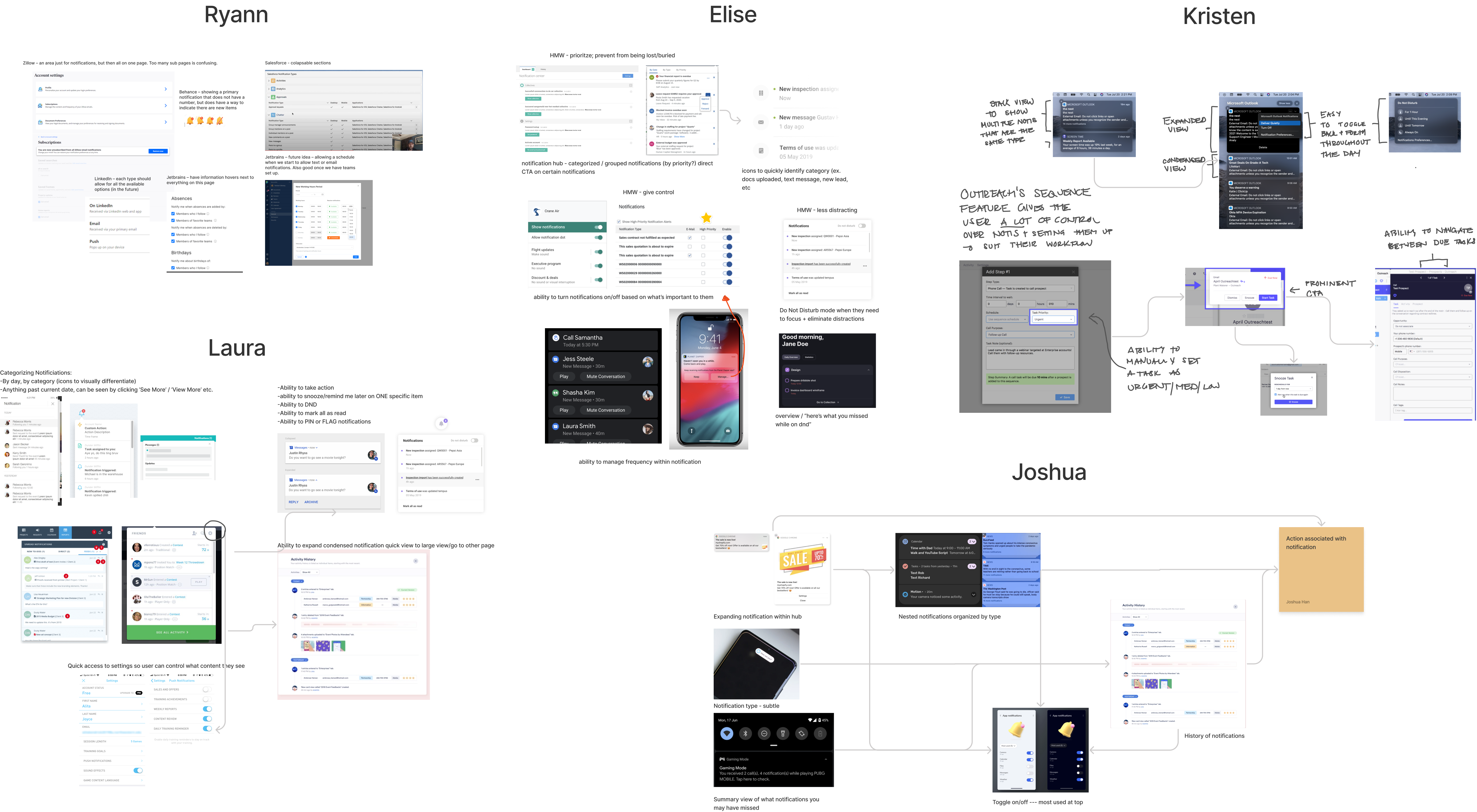
Working off of our inspiration and our own ideas, the team put pen to paper (or stylus to tablet) to create rough sketches of solutions that address the entire user journey. After sketching separately we came together to share our ideas and take a vote on ideas that we see most potential in.
Features that received votes (marked with orange dots) were selected to be built out and tested.
Working off of the top-voted sketches, we developed preliminary prototypes to put to the test in the following days. In between usability tests, we continued to develop the prototype in direct response to user feedback. We focused our efforts on
four experiences:
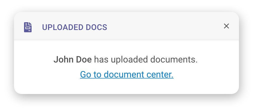
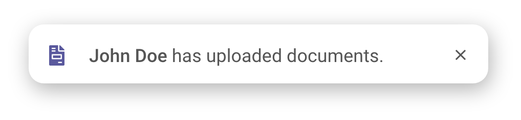
In effort to address our findings surrounding notifications often being perceived as annoying and distracting, we created two different banner styles. One style denotes a high priority item, in which we include a prominent call to action and emphasis on the notification category with an icon, text, and distinct color. The other style denotes a low priority item, in which we place less focus on category with just an icon and color, and do not include a prominent call to action.
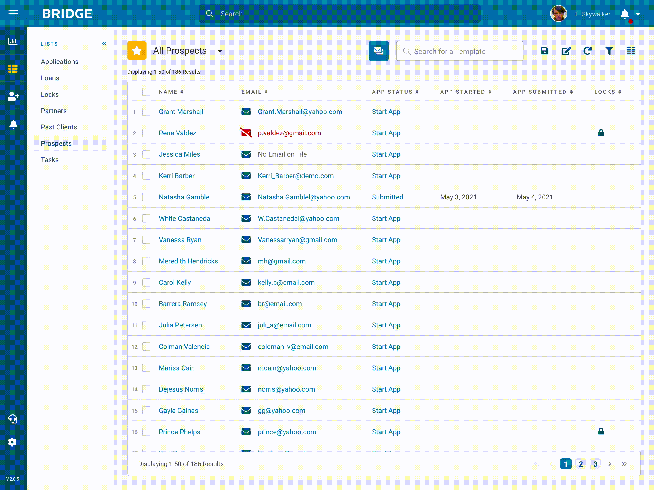
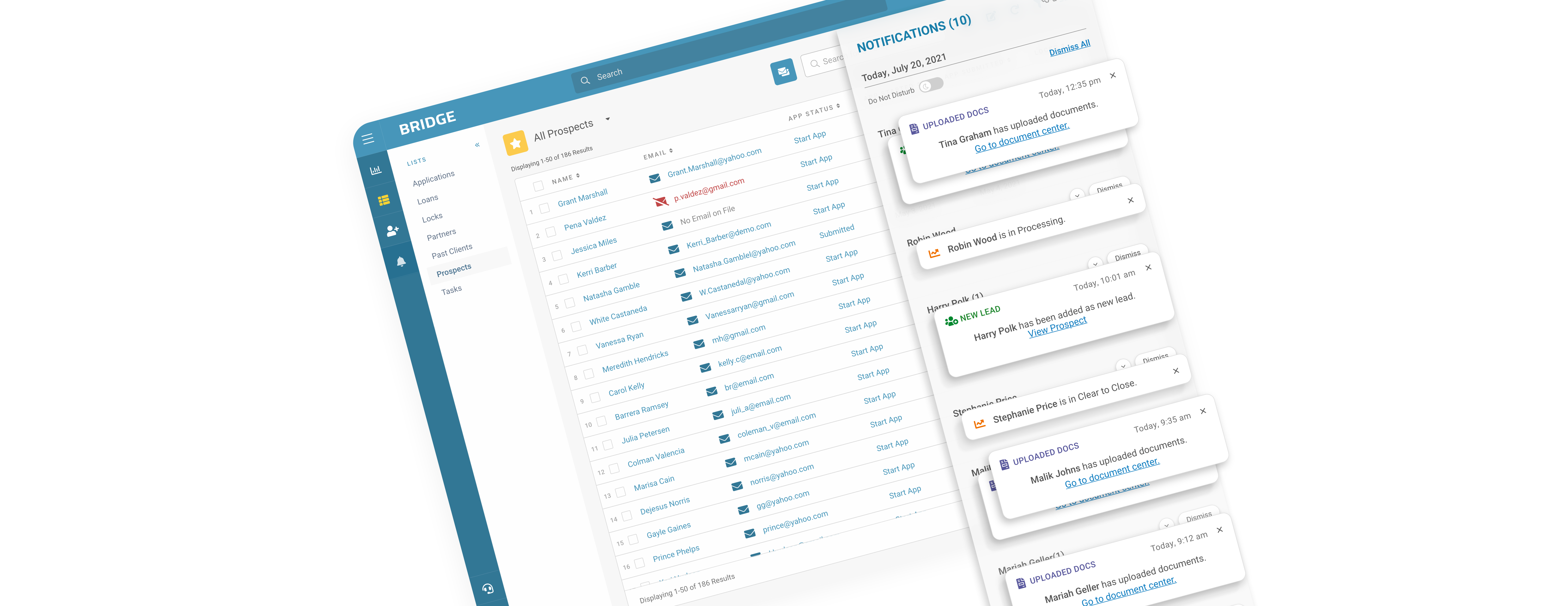
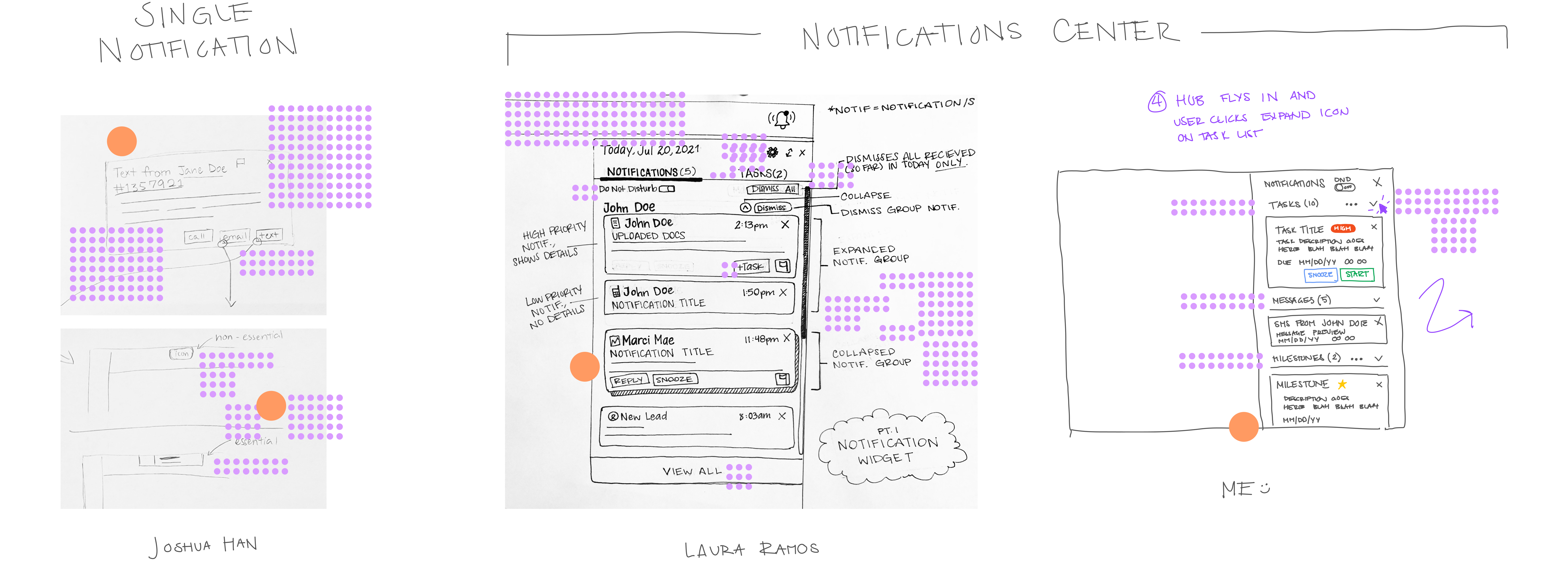
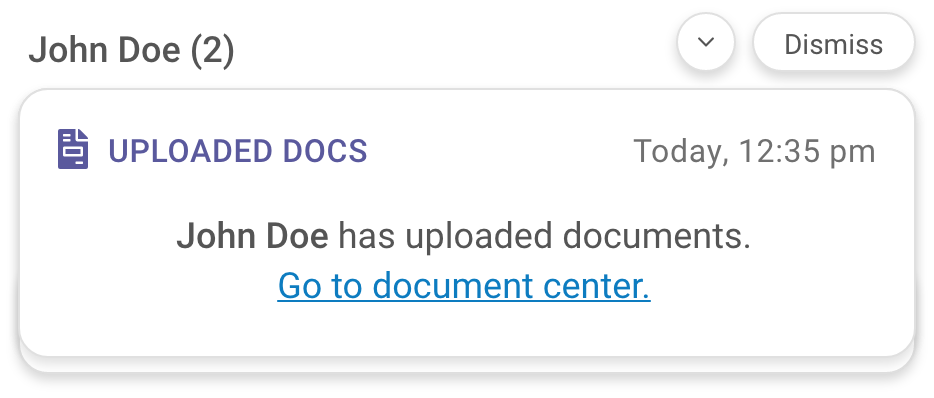
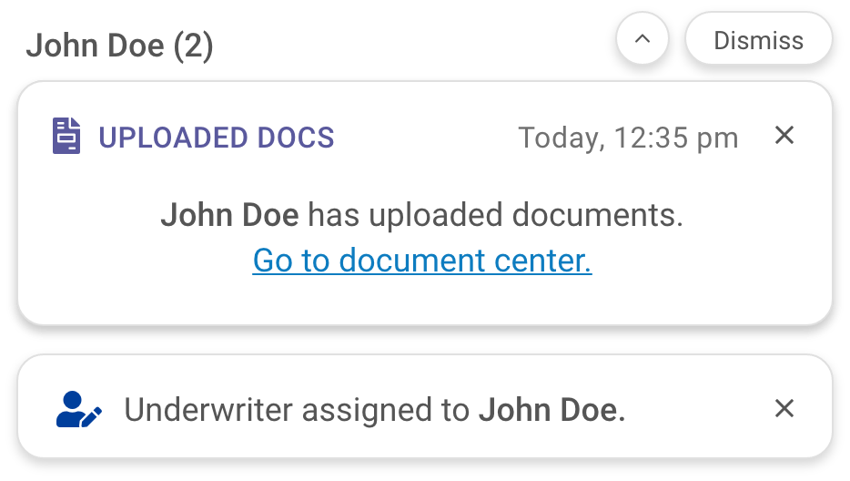
With the intention to reduce feelings of being overwhelmed and prevent notifications from being lost or buried, the notifications center shows only the current day's activity. Given our understanding that loan officers' tend to work prospect by prospect, we've arranged notifications by prospect they pertain to. In the event that there are multiple notifications pertaining to a client, the default view will appear as a stack. When expanded, the user will be able to see all notifications related to the prospect. To dismiss all, the user may tap on the "dismiss" button to the top right of the notification. To dismiss one by one, the user may tap on the "x" within each notification to dismiss one by one.

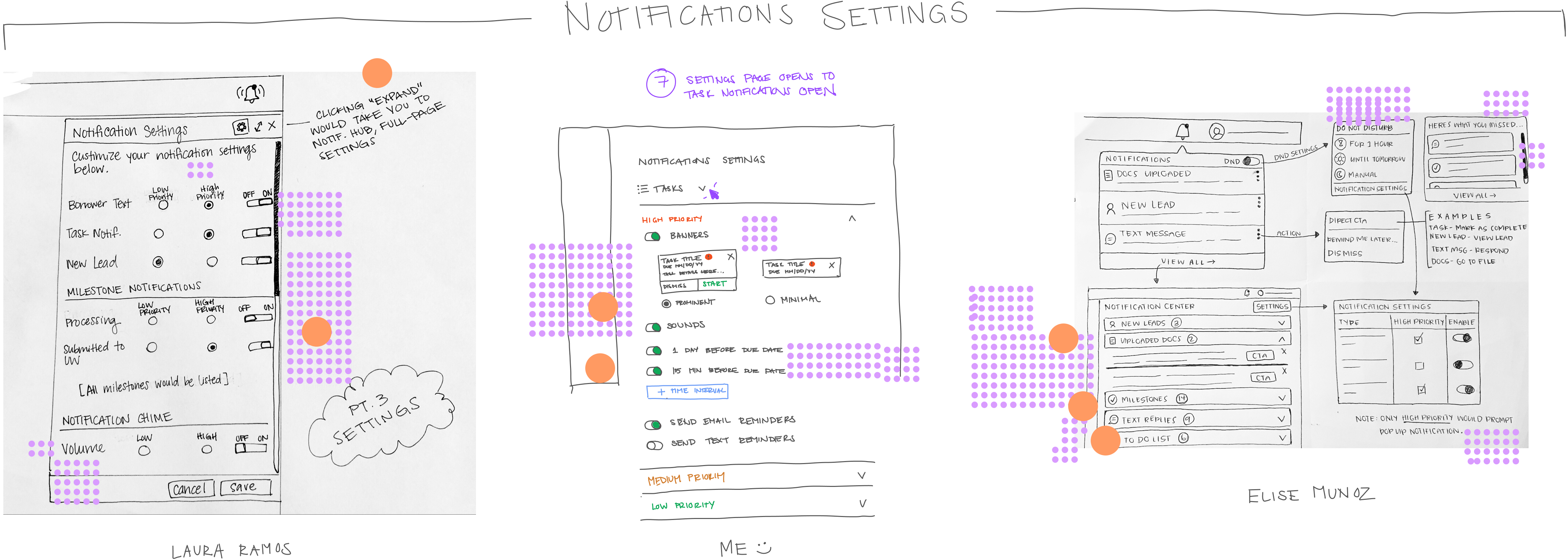
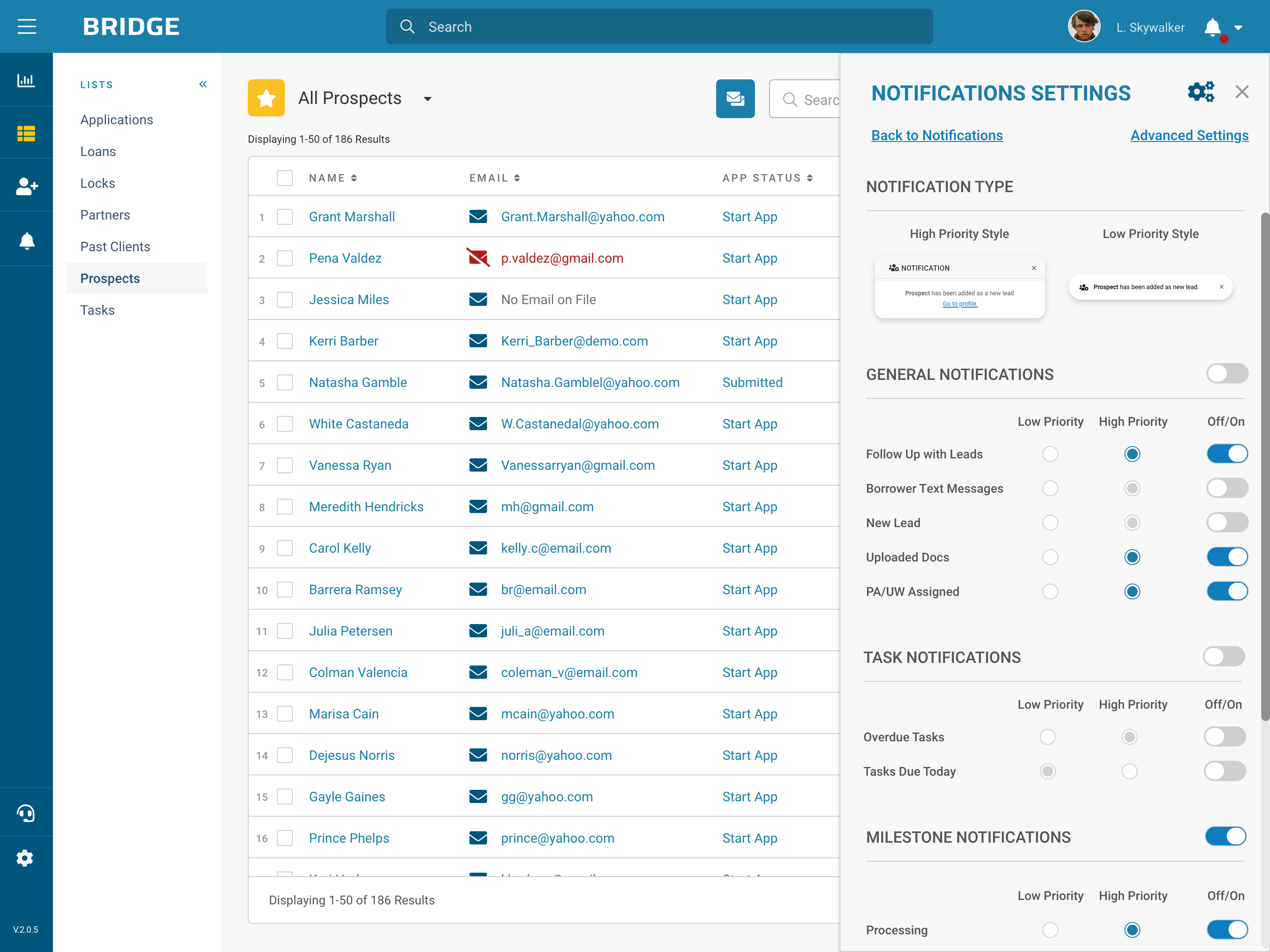
In effort to give loan officers control over what notifications they see quickly, we've provided a settings panel within the fly-in. Here, the user can toggle notifications on and off and change the priority level of each notification type.
We conducted 5, 30-minute-long usability tests with loan officers and found that the testers navigated through the flows with ease and minor frustration. Between sessions we adjusted our designs based on feedback from the testers.
With the help of our testers, we discovered a handful of areas to improve upon. Here are a few tester-driven modifications that are reflected in the designs:
3 months after launch, another survey was sent out to gauge lenders' feelings towards notifications with the new design. It collected 62 responses - here's what we found:
52% of lenders felt that they get too many, 38% felt that they received the right amount, and 10% felt that they received too little. This is a significant improvement from the initial 82% of lenders feeling that they get too many, 17% feeling that they receive the right amount, and 1% feeling that they receive too little.
42% of lenders found them unhelpful, while the greater 58% found them helpful.
Initially, 53% of lenders find them unhelpful, while the remaining 47% felt that they were helpful.